Original Article
BEYOND HUE: COLOUR IN EVERY ASPECT OF ELEMENTS OF ART
|
Pankaj
Dhangar Pal 1*, Prof. M. S. Mawri 2 1 Ph.D. Research Scholar,
Faculty of Visual Arts, Department of Drawing and Painting, D.S.B. Campus,
Kumaun University, Nainital, Uttarakhand, India 2 Professor, Faculty of Visual Arts,
Department of Drawing and Painting, D.S.B. Campus, Kumaun University,
Nainital, Uttarakhand, India |
|
|
|
ABSTRACT |
||
|
Art is one of the most fascinating creations of mankind, providing humans with a deeper understanding of their surroundings and their relationships with one another. Colour has been a primary component of painting since ancient times to the present day. The First Painting made by cavemen was probably a simple line drawing or dot that carried colour. Without colour, one cannot imagine this world. It is one of the main components of nature and a property of light. Colour helps us better understand the world. Colour is one of the elements of art, which are the building blocks of any piece of artwork. The elements of art are: shape, line, form, space, tone/shade, colour and texture. Elements and principles of art are correlated; if elements are ingredients in a dish, principles of art are the recipe. Colour is also mentioned in the “six Limbs of Indian painting”, which gives information about the right use of colour and brush in painting. Colour and other elements of art work together, and more often multiple elements combine to give the desired result in painting. Painting without the use of elements is not possible, and to make it pleasing to the eyes, one should always take care of the right use of elements of art in the right place. In Indian or Western art, colour and the use of other elements are beautifully used in harmony, which can be seen in the paintings of the Lascaux cave, Ajanta cave, or modern art. This study examined the relationship between colour and every element of art, as mentioned above. This study will help us to understand that colour is not only one of the elements of art, but also how it influences and supports other elements. Keywords: Colour, Colour Interaction, Elements of
Art, Colour Relation with Elements, Importance of Colours |
||
INTRODUCTION
Painting is an
important visual art medium that helps to express thoughts and inner feelings
through the use of different methods and materials. In Vishnudharmottara Purana
“Chitrasutra” 10th sloka describes the main component of painting, which acts
as a guiding principle for the artist to express form, beauty, or emotion
through the right use of line, outline, decoration and colour. Sloka/verses Shrotriya (2017)
रेखा च
वर्तना चैव
भूषणं
वर्णमेव च।
विज्ञेया
मनुजश्रेष्ठ
चित्रकर्मसु
कौशलम्॥
Colour is a key
component in painting; without it, painting is incomplete. Just as we cannot
conceive of language without words and symbols, it is equally unimaginable to
think of painting without colours. Colour is the basis for everything we see
around us; without it, life seems dull and uninteresting. Colours evoke a range
of feelings and emotions. When we encounter colours, they can trigger various
emotional responses, some of which are cheerful, while others may be less so.
The history of colour is also a journey marked by significant milestones. Over
time, different colour mediums have emerged, yet their fundamental essence
remains unchanged. In India, references to painting and colours can be found in
numerous texts, including the Vedas, Natyasastra, Vishnudharmottara Purana, and
Kamasutra. In Western societies, numerous scholars have proposed theories about
colours, while many scientists have offered fresh perspectives on the subject.
Artists use colours with full grace and confidence. In Indian art, colours are
used symbolically and are mostly inspired by nature. As in India, “Shadang”,
the six limbs of Indian painting, provide a guiding principle for artists to
use the right elements and principles of art, such that the artwork looks
charming to the eyes and aesthetically pleasing. In “Six limbs of Indian
painting”, Colour is mentioned in the shloka as “Varnikabhanga”, which means
right use of Colour scheme. Thus, it is evident that an artist must pay
attention to colours and possess a solid understanding of them to effectively
harness their advantages and craft a masterpiece.
In painting and
other visual arts, all compositions are expressed through a combination of
elements and principles of art. Elements such as form, colour, etc., combine to
create an artwork that looks soothing to the eyes. All elements of art are interlinked with each
other to form a pleasant effect in painting. Line helps to create shape, shape
with depth creates form, colour gives shape or form its meaning, texture gives
feel, and space is the area that helps the artist to organise all elements in
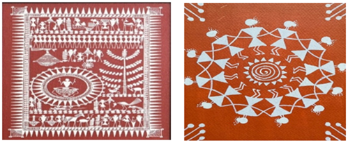
it. Figure 1, shows a painting in which all the elements
of art can be seen. Colour is used with almost all elements of art, like on the
right side, Aipan (folk art of Uttarakhand) is made with white line, texture is
made with red dots, etc.
|
Figure 1
|
|
Figure 1 Painting by a Researcher on Paper with
Acrylic Colour, 2022 |
In contrast, the
history of art provides evidence of the use of the elements of art, including
colours. Even when we look around us, every single piece of nature possesses
colour. We can see the colour and element of art relations in paintings from
the prehistoric era. Colours used were- Yellow, Red ochre, and Black. “In the
Blombos Cave in South Africa,
geometrical shapes were painted approximately 70,000 years ago using lines” Barnett
et al. (2006). In Picasso’s paintings, the relation of
line, shapes, and colour can be seen. This paper explores the relation of
colour to every element of art, how they affect each other when they are
arranged together and how colour behaves when used with different elements. It
seeks to address whether the use of colour is mandatory or its existence in
elements is a law of nature. Furthermore, this study investigates how colour
influences elements of art, based on the nature of the colour used.
Literature review
Colour has a vast
history from the moment we gained vision, or even before. From prehistoric to
modern art, colour has been a main component of art and expression. It is
associated with us culturally, psychologically, physically and emotionally. The
human eye is capable of distinguishing approximately 10 million colours. This
ability is facilitated by specialised photoreceptor cells known as cones, which
are sensitive to red, green, and blue wavelengths of light. Upon the entry of
light into the eye, these cones transmit signals to the brain, which
subsequently interprets these signals as distinct colours. Before Isaac Newton,
people thought colour was a mix of black and white. But in 1666, Newton used a
prism to show that white light could be broken up into a range of colours known
as a “spectrum”. The spectrum includes colours specified as “VIBGYOR”. Colours
travel in different wavelengths. Violet has a minimum wavelength, and red light
has a maximum wavelength in visible light, which is visible to humans from 400
nm to 700 nm Nassau
(1978).
Painting comprises
various elements of art. Elements form the foundation of all creative works.
Artists employ these elements as tools to create their compositions. Each
artwork incorporates some or all of these elements, which interact harmoniously
and are utilised according to the artist's creative intent.
Elements of art
and their relation to colour:
1)
Line: A line is defined as the space between two
or more points. When points move in the same direction, they create the
illusion of a line. Lines may be short, long, curved, horizontal, vertical,
diagonal, zigzag, broken, or wavy. At night, stars appear as points in the sky
and can form perceived patterns or outlines known as constellations. Figure 2 shows how simple dots looking like stars
form the illusion of shape using line.
|
Figure 2
|
|
Figure 2 Stars
Forming Constellations with a Combination of Dots, Shapes and Lines. Source: https://www.starregistry.com/constellation-name/?srsltid=AfmBOoriQc4eB- |
Lines are
expressive and convey a wide range of emotions. Lines moving upward express a
feeling of joy and aspiration, while those directing the eyes downwards evoke a
mood of sadness or defeat. Owen (2025). When a Line is drawn with colour, it
enhances or diminishes the value of the line and gives the line a new meaning.
Cool colours will diminish line attention, while warm or bright colours will
increase it. In the same way, Hazzy or
Zig-Zag red line will give an emotion of Chaos or energy, and a soft or curvy
blue line will show rest and a feeling of joy. When a face is drawn with black
and red colour lines, differences in emotion can easily be seen.
From the
prehistoric period, evidence of line drawings has been found, which were drawn
with red, green and yellow ochre. In Indian art, line has always been the most
important element, which can be seen in different art forms, whether it be in a
cave painting like Ajanta, Sigiriya or in miniature painting or in modern art. Figure 3 shows the use of different coloured lines in
one of the paintings of Ajanta cave titled “Vessantara Jataka”.
|
Figure 3
|
|
Figure 3 Vessantara Jataka: the Story of the
Generous King Vessantara |
Further, we can
see brilliant use of lines in miniature paintings or in the artworks of artists
like Jamini Roy, M.F. Hussain, Vincent van Gogh, Pablo Picasso and many others.
We can clearly see the dominance of soft, hard, or thick lines used with colours.
Starry Night, a Painting by Van Gogh, is a good example of line used with
colours to achieve the desired result of a night view. The artist used floating
coloured lines to represent his emotional turmoil. Artists use coloured lines
not only to represent roundness/stature or form/shape, but also to represent
situational smallness, strength, protrusion, ornamentation, and many other
features. “The Chitrasutra of ‘Vishnudharmottara Purana’ also gives an account
of the importance of line in the sloka as: रेखा
प्रशंसन्त्याचार्याः
चित्रसूत्र, which means: The teacher/master praises the
line, or it is supreme in painting” Pratap
(2022).
“A study conducted
by researchers from the Faculty of Arts & Science's Department of
Psychology, in collaboration with others, and published in the Journal of
Vision, has corroborated previous research identifying consistent associations
between specific colours and lines, and particular emotions. In their study,
Bernhardt-Walther and his colleagues enlisted 40 art students and 41
individuals without artistic training. Participants were instructed to produce
two abstract drawings—one utilising colour and the other employing lines—for
each of the six emotions: anger, disgust, fear, sadness, joy, and wonder. Figure 4 shows drawings which are connected with
negative emotions, contain dark colours and more lines, while those with
positive emotions contain lines which are less dense, curvy and use brighter
colours” Bernhardt-Walther
et al. (2023).
|
Figure 4
|
|
Figure 4 Sample of Study Done |
2)
Shape: “An area which stands out from the space
next to or around it because of a defined boundary or because of a difference
of value, colour, or texture” Ocvirk
(1968).
|
Figure 5
|
|
Figure 5 (Left: Saura Painting; Right: Warli
Painting) Source: https://www.indoscraft.com/products/saura-art-on-canvas https://www.exoticindiaart.com/product/paintings/warli-painting |
Shapes are
two-dimensional, which are formed when a line encloses a space. Shape can be
geometric or organic. Geometric shapes are- Circle, square, triangle or
rectangle, which are precise and regular, and organic shapes are
irregular/curvy/informal than geometrical shapes. The relationship between
colour and shape is seen all over the world. When we talk about prehistoric
times, simple shapes were in fashion, like circles or triangles. Early humans
used these shapes with colours to make simple drawings around them, sometimes
they also used organic shapes. Folk art, like Warli and Saura in Indian art
shows examples that use simple shapes in painting. Figure 5, shows how tribal people used simple shapes
to show their culture. “Colours used, red ochre for background, which symbolise
prosperity, while white colours represent purity and clarity” Exotic
India Art (2021).
“Historical
accounts of the connection between colour and shape often start with the
Russian artist Wassily Kandinsky, a pioneer of modern abstract art and a
prominent member of the Bauhaus movement. Kandinsky once conducted a
questionnaire among workshop participants, including his Bauhaus
contemporaries, asking them to select which of three colours (red, blue,
yellow) best corresponded to a square, a triangle, and a circle. Figure 6 Shows that the result of the questionnaire,
in which a triangle was linked with yellow, a square with red, and a circle
with blue” Dreksler
and Spence (2019).
|
Figure 6
|
|
Figure 6 Kandinsky Form and Colour Exercise, Done
by the Researcher |
Further, Makin and
Wuerger tested the theory among British participants using the Implicit
Association Test (IAT) and did not find similar results to Kandinsky's
colour-shape associations. After that, a new study was conducted among Japanese
participants, and the results were similar to those of Makin and Wuerger,
showing little support for Kandinsky's theory. In a study conducted among
Japanese people, colour–shape associations were: triangle to yellow, square to
blue, and red to circle. The IAT findings suggest that Kandinsky's proposed
associations between colour and form are not supported, indicating that these
associations are likely not a universal characteristic of the visual system Makin
and Wuerger (2013).
In Indian art, a
few examples show the relation between shapes and colour. We can see the work
of S.H. Raza, G.R. Santosh, Ram Kumar, and Dhanraj Bhagat, among others. Figure 7 shows the artwork of S.H. Raza, in which the painting typically
features organic shapes and rich, earthy colours symbolising fertility and the
birth of consciousness. The black circle seen in Bindu is a key aspect of
Ankuran. It symbolises creation, and black represents the birth of all other
colours. Black appears throughout the painting, emphasising the fundamental
seed of life Wong (2024). Some scholars have also suggested that
specific shapes may attract greater attention based on their size, colour,
value, texture, or where they are placed on the picture plane.
|
Figure 7
|
|
Figure 7 S. H. Raza, Ankuran Source: https://shop.vadehraart.com/products/s-h-raza-ankuran-limited-edition-print |
In the early
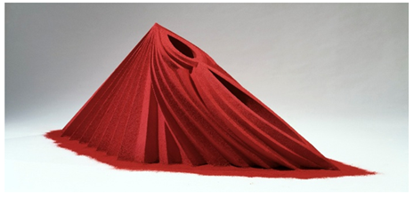
1980s, British sculptor Anish Kapoor (born 1954) created a collection of
colourful sculptures of shapes that demonstrated his belief in the strong link
between shapes and colours. Figure 8 Shows Anish Kapoor's sculpture, which is the best example of colour and
shape relation. He used wood, gesso and pigment and expressed the feeling of a
mother.
|
Figure 8
|
|
Figure 8 Anish Kapoor, Mother as a Mountain, 1985 Source: https://walkerart.org/collections/artworks/mother-as-a-mountain |
3)
Form: Ralph L. Wickiser said, “Form refers to the
configuration of a volume or mass that reveals its inherent characteristics. It
represents the genuine enclosure of space to generate volume. Form constitutes
an occupied space, providing a physical description of an object within a
spatial context” Shukla
(1969).
Forms are
three-dimensional figures that encompass length, width, and height. Examples
include a cuboid, a cube, and a cylinder. Sometimes, form is also referred to
as volume or physical mass. In painting, form is presented in a 2-D surface
with the help of shades and light. We can produce a form desirable by using
different colours or by using a single colour with different shades of the same
colour. The relation of form and colour is undivided, without shade or light;
form is incomplete. When any colour is used with form, it gives meaning to
form. Form without colour is like food without salt. For example, a flat red
coloured apple will not look as appealing as an apple with red colour having
different shades. In painting, form is created solely through the use of
colour; without it, form lacks significance. A painting, whether depicting a
landscape or a simple portrait, appears lifelike with the presence of colours
and their various tints and shades. In the Ajanta cave paintings, we can
clearly see how artists used different colour shades to give the illusion of
three-dimensional forms. Every colour used shows the relation of that form to
colour. In Indian Painting, colour has a symbolic meaning when used in
different forms, such as in Kalighat paintings. Mata Kali is always drawn with
black colour, which symbolises infinity. In Western art, art movements like the
Renaissance, Baroque, Realism, Neoclassicism, etc, are the outcomes of Colour
and form. One can’t imagine form without colour.
“In the
two-dimensional art, form refers to the area that holds the colour”- N. Knobler
Mawri
(2007)
Brancusi’s Bird in
Space. The figure is vertically oriented with curved outlines, elegant
proportions and a highly reflective bronze surface. Its golden hue may evoke
associations with the sun, thereby reinforcing the connection to birds and the
sky Adams
(2011). Brancusi’s Bird in Space is shown in Figure 9
|
Figure 9
|
|
Figure 9 Constantin Brancusi, Bird in Space |
4)
Space:
The area occupied by
shape/form, in between and around. Form and shapes are arranged in space. It
also refers to perspective, the space between foreground and background. Space
can be categorised as either Positive or negative. Positive area refers to the
area of space/form or subject occupied, and negative area is the area without
shape/ form or empty. Space and colour are related in every aspect, like in
paintings from any period, we can see the use of colour in such a way that
space is divided into many parts. Overlapping of shapes tends to create a
feeling of depth and arrangements of light/dark.
In a painting from
the Mughal period, “ Akbar’s adventures with elephant Hawai” from Akbarnama, we
can observe the artist’s use of linear perspective to depict distance and depth
in the view. They depict images of smaller sizes in the upper corner and pictures
of comparatively bigger sizes in the foreground Rao (2022). Features like reduced size of distant
objects in a landscape, the use of blue colour tone in distant elements, the
3-D effect of architectural components through rendering, and an indication of
mass in the figure are a few examples of the interconnection of colour and
space in artwork Singh
and Singh (2024).
Placing bright
colours close together reduces the illusion of space and deepens it. A grey
background gives the form a wider space Shrotriya
(2010). The first challenge in the creation of art
is to break the emptiness of space. This can be achieved either through
emotional or intellectual means. The tools for breaking this emptiness are
line, form, colour and texture Agarwal
(2019).
Colours influence
perception in space; colours that are warm and bright generally seem to be
nearer to the picture plane, whereas cool or muted colours tend to recede into
the distance. A surface featuring hues that are similar tends to merge. As a
result, the illusion of spaces is minimised, and the space itself is condensed.
When the shapes and the background are closely related in tone and value, they
seem to have less space between them. Flat shapes can create an illusion of
shallow space. Space is reduced when a picture plan is covered with shapes that
touch each other Malcolm
(1972).
5)
Value: Tone/value is considered one of the
properties of colour. It is closely related to colour. Value makes a focal
point and gives shape a dimension in visual composition. Tone/value is used to
create the effect of:
·
Contrast
between light and dark.
·
illusion
of form with three- dimensionality.
·
dramatic
light and tranquil atmosphere.
·
depth
and illusion of distance in the picture plane Trujillo
(n.d.).
By the use of
value or tone, we can achieve an illusion of a 3-D effect on a 2-D surface. It
also gives an illusion of volume in painting. Excess use of values used in
combination can be confusing. This might result in a weak design. One can
achieve the right values, with proper use of light, medium and dark tones Malcolm
(1972). Value is directly affected by the light or
darkness that surrounds it. Shapes that seem to close in values give an
illusion of merging. Usually, dark or bright values generally appear to come
forward, and light or muted values tend to recede, but the reverse can occur.
In a piece of artwork, sharply contrasting values attract the attention of a
viewer; also, the difference in size or illusion can be created with
contrasting value usage, like the use of light and dark or vice versa. In
Painting, the use of right value is so important that it can affect the entire
composition and is also used to highlight important shapes and recede shapes,
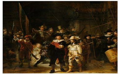
which are not that important in that composition. One can clearly see paintings
of Rembrandt to see the use of the contrasting effect of value in painting Figure 10
|
Figure 10
|
|
Figure 10 Rembrandt "The Night Watch" 1642 |
6)
Colour: Colour itself is an element of art. “Colour
is a property of light and is perceived by our brain through the medium of the
eyes” Mawri
(2007)). Hue, value and intensity are the terms
that are used to identify colours. According to colour theories, colours are
divided into: Primary, Secondary and Tertiary colours Figure 11.
|
Figure 11
|
|
Figure 11 Primary, Secondary and Tertiary Colours |
Colours are
everywhere, without colour we can’t imagine our world. Many philosophers,
artists, physicists and chemists have given their lives to understand colour
and colour history. In 1704, Issac Newton, in his book “Optics”, illustrated the relation of colours
and gave a rule for the colour mixture of light. Later, many studies were
conducted to study the colour. Today, artists use colours in different ways
according to their wishes, and many more colours are made using modern technology,
which has been a blessing for artists to create masterpieces.
7)
Texture: Texture is a quality of a surface; it can be
smooth, rough, dull or glossy. Texture can be Actual/Tactile or Implied/Visual.
Tactile textures are actual or real textures that can be felt by touching.
Implied texture is texture that is not real, and is only an illusion created by
artists, such that it looks like real texture. An artist can use both Actual
and Implied texture in his work, by his skill, the right use of colour and
tone. Colour and texture are interconnected, as Value/tone is a main component for
an artist to make an effect of texture. Thick paint, or the use of a brush,
knife, or other tools, can be used to create texture in artwork. Texture can
affect the perception of colour; for example, a rough texture may give colour a
darker appearance, and a smooth texture can change the effect of colour.
Texture, when used with colour in an artwork, gives an extra touch and realism
to the artwork. When used with colour, texture provides a more dynamic and
engaging visual effect, enhancing the beauty of the artwork. Art movement, like
Impressionism, is a good example, in which artists like Claude Monet used an
impression of things with the thick use of colour to get the desired
result. Figure 12, showing the texture achieved in painting
with the use of thick colours. A study
done by the University of Leeds Department of Colour Science, UK, an experiment
done on colour-texture combinations and the viewer’s feelings. This experiment
showed that texture has a large impact on preference. How texture and colour
affect emotions and preferences of choices in clothing and the choice of
fabrics Chang et
al. (2007).
|
Figure 12
|
|
Figure 12 Abstract Impasto Landscape |
Methodology
In this analytical
study, a qualitative study approach has been used to examine the relationship
between colour and elements of art and how they are interconnected. To achieve
this, an extensive review and analysis were conducted on books, previously published
research papers, articles, websites, online books, and images.
Discussion
During the review
of the literature, we came across various information about elements of art and
colour history, properties and theories of it. In this study, various important
information is gathered regarding various aspects of colour and its use in elements
of art. Various examples are given to show the relation of colours to elements.
Colour can alter
how space is perceived, producing false impressions of size, proximity,
separation, or distance. Colour may define space and minimise or disguise
things and areas. It can be used to establish attention or focus in a
composition, as well as to establish continuity between disparate aspects in
design. Emotions and moods can be conveyed through colour. Colour can be used
to warn, alert, or distinguish between similar-sized and shaped items. It might
be a nonverbal language that conveys concepts without using words. Holtzschue
(2011)
Conclusion
The study found
that colour as an element of art is connected with other elements of art.
Without it, art is incomplete; the main essence of painting lies in its
composition and colour scheme. Colour and elements are interconnected, and
every element, such as line, texture, value/tone, shape, form, and space, uses
colour in every aspect of its formation. Without the use of colour, all the
other elements of art are incomplete. They possess colour in the formation of
their composition, and sometimes, a difference is made in the visual
composition between elements of art because of colours. Colours have symbolic
meanings and psychologically affect viewers. With the right use of colour,
every composition becomes aesthetically pleasing. This study draws on a range
of research papers and various books to substantiate its findings concerning
colour and its relation with other elements. Various paintings have been used
to study the effect of colours in relation to elements. So, it is concluded
that colour and elements of art have always been used together and complement
each other in an artistic composition.
ACKNOWLEDGMENTS
None.
REFERENCES
Adams,
L. S. (2011). A
History of Western Art. McGraw-Hill.
Agarwal, G. K. (2019). Rupankan: Fundamental of Plastic Art. Sanjay Publication.
Barnett, J., Miller, S., and Pearce, E. (2006). Colour and Art: A Brief History of Pigments. Optics and Laser Technology. https://doi.org/10.1016/j.optlastec.2005.06.005
Bernhardt-Walther, Damiano, C., and Rezanejad, M. (2023, May 3). Researchers Explore How We Depict and Perceive Emotions Through Colour and Line in Visual Art. University of Toronto.
Chang, K., Ou, L. C., and Luo, R. M. (2007). The Impact of Texture on Colour. International Conference on Engineering and Product Design Education.
Dreksler, N., and Spence, C. (2019). A Critical Analysis of Colour–Shapes Correspondences. i-Perception, 1–2. https://doi.org/10.1177/2041669519834042
Exotic India Art. (2021, September 21). Warli Art. Exotic India.
Fox,
J. (2023). The
World According to Colour. Penguin Books.
Holtzschue, L. (2011). Understanding Color: An Introduction for Designers (4th ed.). John Wiley and Sons.
Makin, A. D., and Wuerger, S. M. (2013). The IAT Shows No Evidence for Kandinsky’s Color–Shape Associations. Frontiers in Psychology. https://doi.org/10.3389/fpsyg.2013.00616
Malcolm,
D. C. (1972).
Design: Elements and Principles. Davis Publications.
Mawri,
M. S. (2007).
Fundamentals of Painting. Taxhila Prakshan.
Nassau, K. (1978). The Origin of Color in Minerals. American Mineralogist.
Nassau, K. (2025, September 29). Colour. Britannica.
Ocvirk, O. G. (1968). Art Fundamentals: Theory and Practice. W. C. Brown Company.
Owen, P. D. (2025, October 21). Painting. Britannica.
Pratap, R. (2022). History of Indian Painting and Sculpture(भारतीय चित्रकला एवं मूर्तिकला का इतिहास). Rajasthan Hindi Granth Akademi.
Rao, D. K. (2022). Pictorial Elements of Indian Miniature Painting. ShodhKosh: Journal of Visual and Performing Arts, 15–26. https://doi.org/10.29121/shodhkosh.v3.i1.2022.62
Shrotriya, S. (2010). Fundamental of Painting. Pratiyogi Prakshan.
Shukla, J. (1969). Fundamental of Painting: Various Aspects. Bhartiya Vidya Bhawan.
Singh, M., and Singh, R. (2024). The Art of Depth: Uncovering the Hidden History of Linear Perspective in Indian Painting. Towards Excellence, 24–31. https://doi.org/10.37867/TE160403
Trujillo, M. S. (n.d.). Elements of Art. https://www.strujillo.ca/elements-of-art.html
Wong, Y. (2024, November 27). S. H. Raza: Biography, Paintings, History, and Achievements. ASTAGURU.
 This work is licensed under a: Creative Commons Attribution 4.0 International License
© Granthaalayah 2014-2026. All Rights Reserved.