Original Article
Enhancement in Chromostereopsis due to Effect of Impasto thick paste of colour
|
Rajendra
Bhatia 1* 1 Research Scholar, MA (Drawing
and Painting), DAVV, Indore, India 2 Head and Professor,
Department of Drawing and Painting, Government Maharani Laxmi Bai Girls PG
College, Kila Bhavan, Indore, India |
|
|
|
ABSTRACT |
||
|
In a practice of art work, particularly while painting, an artist seems to bring about visual depth of certain areas of the painting with help of changing or altering hue using tints, shades, and tones of different colours. Here, in this paper I have discussed a property of a pair of colours causing Chromostereopsis, that is, a visual effect of certain pair of colours where one colour is seen ahead of the other colour even though they are on a two-dimension surface. At the same time, I have discussed the possibility of enhancement of depth when these colours are applied over a textured surface created with help of Impasto. I have used experiments to access the hypothesis, where I conducted three experiments; one each for showing the known Chromostereopsis with complimentary colours, second using same pair of colours over a textured surface created with help of Impasto (thick paste) of white and grey colours. I conducted the third experiment by reversing the places of the two colours of the pair that was used earlier. Some amazing results were found, which have been noted and discussed in the discussion The hypothesis was established both by reading on internet about Chromostereopsis and Impasto and with findings from my experiments. Keywords: Chroma, Color, Stereopsis, Perception of Depth, Impasto, Thick Layering of Color |
||
INTRODUCTION
In an era of
augmented reality, where images have started to popping up and out, this
research paper is written on the very root cause of an illusion that is
perceived as a visual depth in an art work, done with colours that cause Chromostereopsis and the physical layering of thick colour
called as Impasto.
There are two
things that seems to cause a little or more change in visual perception of
depth; one is Chromostereopsis, which is an illusion
of one layer of colour being ahead than the other layer of colour in a
two-dimension art work, whereas the other is a physical layering of Impasto,
which causes an exaggerated illusion of depth.
|
Figure 1
|
|
Figure 1 |
There is even a
third factor that seems to cause an alteration in the perception of depth, that
is the illumination of the colours used. Here the alteration is different.
There may be uplifting of the colour layer which has brighter illumination.
Hypothesis
Will impasto,
which is a thick layering of color, enhance the
illusion of depth created by Chromostereopsis? Also,
does the illumination of a bright colour used in the back drop alter the whole
process of Chromostereopsis?
Chromostereopsis
·
Chromostereopsis
is a type of visual perception where a specific colour is perceived closer to
or farther from the observer than the other colours in a plane pattern.
·
“Colours
on a flat two-dimensional surface can appear to lie in different depth planes.
This phenomenon, readily seen on a computer monitor, is called Chromostereopsis.” Thompson
et al. (1993)
·
The
mechanism is considered to be binocular stereopsis by the chromatic aberration
of the eyeball optical subsystem. This possibly occur due to difference of
wavelength of the two colours.
“Individual
Differences in Chromostereopsis under Natural Viewing
Condition” Hayashi
et al. (2012)
|
Figure 2
|
|
Figure 2 Chromostereopsis on Plain Paper |
Impasto
“Paintings are
generally considered in terms of their (2D) depiction, but the physical artwork
also has a third dimension. Artists deliberately created 3D textural effects on
the surface. For instance, the use of impasto to create additional reflections for
highlights” Willemijn
(2019).
“Impasto creates a
richly textured, three-dimensional surface that can catch the light or create
tiny areas of shadow, enhancing the drama of a painting”. Willemijn
(2019).
|
Figure 3
|
|
Figure 3 |
|
Figure 4
|
|
Figure 4 |
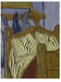
“This artwork by
Vincent Van Gogh depicts thick colours (Impasto) uses.
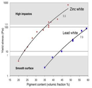
“In the work by Elkhuizen and colleagues investigated the rheology of white
paints, specifically lead white and zinc white, to explain how Vincent Van Gogh
achieved his famous impasto technique”
“Impasto is an
additive technique that creates a tangible, three-dimensional surface,
strengthening the sense of depth and layers.” Baxter
et al. (2004).
“Research
consistently highlights that the raised surfaces of impasto catch light
differently, creating a dynamic interplay of light and shadow that changes with
the viewer's position or the light source's angle.” Baxter
et al. (2004).
Method
Although, there is
no research on the use of a combination of Impasto and the Colours causing Chromostereopsis to study Visual Enhancement of depth in
either of the two; Chromostereopsis and Impasto. So,
I had no choice but to depend on Experiments to assess my hypothesis. I
conducted different experiments to depict Chromostereopsis,
and enhancement of its effect by adding elements of Impasto. I am enlisting my
experiments and their findings here one by one and discussing their results in
relation to my hypothesis.
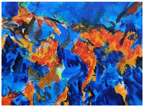
Experiment One
|
Figure 5
|
|
Figure 5 Chromostereopsis on Plain Paper |
·
I
selected to paint tints and shades of orange and vermilion alongside of tints
and shades of different Blues on plain sheet of paper.
·
The
material used were acrylic colours with water as solvent, on cold pressed 300
gsm sheet from Canson.
Findings: A
positive “Chromostereopsis” effect was found on plain
sheet of Paper, using only the high contrast colours.
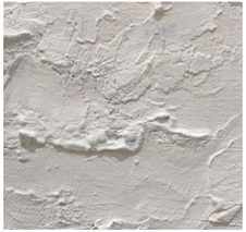
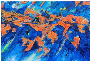
Experiment Two
Chromostereopsis on textured (Impasto) paper
|
Figure 6
|
|
Figure 6 Plain Impasto |
|
Figure 7
|
|
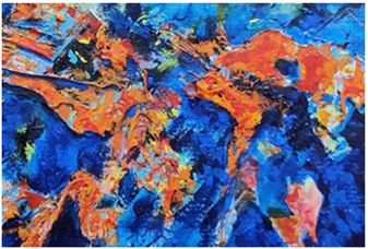
Figure 7 Chromostereopsis on Impasto (Textured Paper) |
·
In the
second experiment, I applied thick paste of self-prepared Impasto Figure 5, which was later painted with complementary
colours bearing Chromostereopsis effect
·
I
selected to paint tints and shades of orange and vermilion on upper layer of
dried impasto, the higher layer of texture, and tints and shades of different
Blues on the lower layers of the texture.
·
An
increased positive “Chromostereopsis” effect was
found as compared the same set of colours applied on a plain surface sheet
(Experiment One)
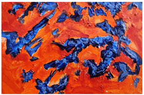
Experiment Three
|
Figure 8
|
|
Figure 8 Chromostereopsis on Textured Paper |
Here, I reversed
the placement of paint by applying the tints and shades of different Blues on
the upper layer of an impasto (the higher layer of texture) and tints and
shades of orange and vermilion on the lower layers of the texture.
Some strange
results are seen here, as I see
·
The blue
colour that was painted on the upper part of the texture has receded and seen
as the far colour.
·
The
orange and vermilion, which was painted on the lower surface of the texture,
seems to have come up and seen as the near colour.
Discussion
·
While
Experiment One reconfirmed the known effects of Chromostereopsis,
which is realisation of depth in two contrasting colour layers.
·
Experiment
two showed an enhancement in the illusion of depth with additional use of
Impasto as first layer, followed by colouring with colour-pair that causes Chromostereopsis
·
The
experiment three shows some interesting things. The orange along with
vermilion, which were painted on the lower layer seems to have lifted the
surface to the extent that it looked nearer to the observer, and the blue had
receded to the extent that it not only nullified the raised impasto surface,
but took it further down to show the blue to be far.
·
One
observation is that the orange was not made dull. Hence probably the
illumination of it brought it near to the observer.
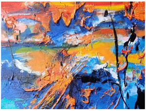
Expected outcome
|
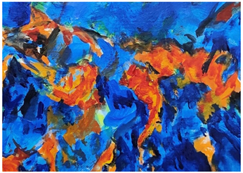
Figure 9
|
|
Figure 9 The Picture
Depicting Illusion of Dual Depth with Impasto and Chromostereopsis |
·
Although
it will be little too early to conclude, however, relearning with the dual
effect of the depth with Chromostereopsis and Impasto
may bring about a new understanding in the latest of the science of creating
depth in the paintings, murals, and other forms of Art.
·
The
question for further analysis: Is this research paper leading to a new practice
of an enhanced visual effect in art of Painting? And my emphasis is that “Is
this enough of proof to call it a beginning of Chromo-Impasto-ism.
·
Further
study on illumination effect of different colours and formation of their pair
for effect of Chromostereopsis should be carried out
to make it more practical for use in the practice.
·
A
comparative study of the Stiles-Crawford effect (as mentioned by Thompson and
et al), to this nearing of the surface due to illumination may also be carried
out to further explain the illusion experienced here by the author.
ACKNOWLEDGMENTS
First and
foremost, I want to thank my mother Late Shiv Mohini Bhatia to have brought me
to this world and give me this instinct to do an artwork and also a
thoughtfulness to analyse it. At times I feel that it is she who does it and I
am just a channel.
I sincerely want
to thank my guide Dr. Kumkum Bharadwaj, HOD (DandP),
Maharani Laxmi bai Govt. Girls Post Graduate college, Kila Maidan, Indore, to
always motivate and encourage me to write this paper.
REFERENCES
Baxter, W. V., Wendt, J., Lin, M. C., et al. (2004). IMPaSTo: A Realistic, Interactive Model for Paint. Proceedings of the 3rd International Symposium on Non-Photorealistic Animation and Rendering. https://doi.org/10.1145/987657.987665
Hayashi, T., Kawai, Y., and Sakata, Y. (2012). I-Perception.
Thompson, P., May, K., and Stone, R. (1993). Chromostereopsis: A Multicomponent Depth Effect. Vision Research. https://doi.org/10.1016/0141-9382(93)90093-K
Willemijn, S. E. (2019). This is Not a Painting: Scanning and Printing a Painting’s Appearance. In T. W. J. Callewaert (Ed.).
 This work is licensed under a: Creative Commons Attribution 4.0 International License
© Granthaalayah 2014-2026. All Rights Reserved.