ShodhKosh: Journal of Visual and Performing ArtsISSN (Online): 2582-7472
|
|
Revisiting Title Design in Vernacular Cinema: A Cine Semiotic Analysis
Rani Preethi M 1 ![]()
![]() ,
Dr. Mahalakshmi Selvaraj 2
,
Dr. Mahalakshmi Selvaraj 2![]()
![]()
1 Assistant
Professor, Department of Visual Communication, Patrician College of Arts &
Science, Chennai, India
2 Assistant
Professor, Department of Electronic Media, Patrician College of Arts &
Science, Chennai, India
|
|
|
ABSTRACT |
|
|
Indian cinema is a term
that refers to films made in India since time immemorial and has greatly
influenced world cinema. Indian Cinema includes various regional languages
and among them is Tamil cinema that produces films in the Tamil language with
a very wide audience. It showcases varied and interesting patterns of visual
culture. Film posters play a vital role in exhibiting these visual cultures
and serve as the essence of a film’s soul. Film posters have a deep-rooted
relationship with Indian cinema and one of the important parts of these
posters is the title design. Title designs are synonymous with the story of
the film with a view to create a visual force. The title designs have a
modern facelift in the digital era. The use of new graphic techniques,
expressive typography, composition, and color creates a lasting impact
particularly in new age film title designs. The current research aims to
examine the title designs in Kollywood film posters using a semiotics
approach. Analysis is done based on the following aspects such as structural
parameters, relationship with the theme of the film, context of use and
production techniques. |
|||
|
Received 10 October 2023 Accepted 18 March 2024 Published 23 March 2024 Corresponding Author Rani
Preethi M, rpm0898@gmail.com DOI 10.29121/shodhkosh.v5.i1
NCJCFPC.2024.802 Funding: This research
received no specific grant from any funding agency in the public, commercial,
or not-for-profit sectors. Copyright: © 2024 The
Author(s). This work is licensed under a Creative Commons
Attribution 4.0 International License. With the
license CC-BY, authors retain the copyright, allowing anyone to download,
reuse, re-print, modify, distribute, and/or copy their contribution. The work
must be properly attributed to its author.
|
|||
|
Keywords: Kollywood, Film Posters, Semiotics, Title Design,
Sign, Symbols |
|||


1. INTRODUCTION
Film is a dynamic entertainment medium that has manifested the emerging trends of visual culture. A film poster serves to promote the film, offer a glimpse of the plot, characters and also persuade the audience to watch it. Film posters have been in place since time immemorial and have a very deep rooted attachment with the Tamil cinema industry in particular. Film posters were initially handmade and slowly reflected the art forms existent at that particular point of time Farah (2023). Back then, design, typography in the film posters took a backseat and rather served the utilitarian purpose of only conveying details such as the name of the film, studio production, cast and crew. This is evident in the history of motion pictures that dates back to 1896 when Lumiere Brothers created a small video clipping that was known to be the earliest film with a shot of a train arriving at a station and people ducked down.
Figure 1

|
Figure 1 Film
Poster ‘L’ Arrivee D’ Un Train A La Ciotat’ - 1896 Source IMDB |
The typography in film posters were hand made by lettering artists and typesetters. These handmade typography were then photographed and used in the posters. The production techniques of both films and poster making have changed altogether in today’s context. The Indian film industry boasts of being the largest to produce feature films in the world and is also the second oldest in the world. Large numbers of title designs and posters are designed and showcased for public viewing with an intent to promote the film and gain popularity. The title design of a film poster may reflect art and design movements, evoke genres, establish the subject matter and do much more. Film posters have got a modern facelift with the emergence of digital technologies. Creative and able designers maximize the utility of the digital tools to create appealing posters that serve as the visual strikers seeking necessary attention towards the film. The visual essence of film is to do with trailers and teasers yet it is the film posters that unveil the very look of a film and contribute much to the new-age visual culture Raman (2019).
Poster making for films is an art as well as science. It is more than just a desktop publishing and is carefully crafted with a lot of elements. A film poster consists of the film’s title, visual elements, name of the cast, crew and other information pertaining to its release. Among these elements, the film’s title is a very important one. It helps to create a sense of drama, conveys the emotion, and conveys the genre and aides in catching the attention of the audience. The aesthetic value of the film title is primarily constituted by its typography. Britannica defines typography as selection and design of letter forms that are organized as words and sentences and displayed as blocks of types printed in pages Wells (2019). The current research aims to gain an in depth understanding of the title designs in select Tamil films using the semiotics framework. Various aspects pertaining to the film title will be analyzed and discussed.
2. REVIEW OF LITERATURE
2.1. SEMIOTICS
Human interpretation of things is based on their understanding and existing knowledge. One cannot take things for granted in reality and intend to define it objectively. Semiotic analysis helps in understanding the construction of reality and the part played by all those involved in creating it. In simple terms, semiotics refers to the study of signs and symbols in communication. Signs may take the form of words, images, and objects Chandler (2006). Umberto Eco in his book ‘A Theory of Semiotics’ has manifested that the umbrella of semiotics includes everything that can be taken as a sign. They get their intrinsic meaning only when they are interpreted like one. Pioneers in the field of semiotics have agreed that semiotics includes everything that can be seen or interpreted Chandler (2006), Yakin & Totu (2014). Semiotics, also known as semiology, is the study of how sign systems generate meanings and is, in Roland Barthes' words, structuralism applied to signs rather than language. It has three types of signs: the iconic, which is a sign that resembles what it stands for, like an image of an object; the indexical, which is a sign that is connected to what it stands for by association, like lightning and speed; and the symbolic, which has a purely conventional relationship with the referend.
2.2. SEMIOTICS AND PARADIGMS
The beginnings of the classical semiotic philosophy and its impact in the life of mankind dates back to more than two thousand years by the Greek philosophers. Later in the Middle Ages, philosophers and academics discussed the uses and interpretations of signs Yakin & Totu (2014). The actual reference to the term ‘semiotics’ developed towards the end of the 18th century and was introduced by German Philosopher Lambert. Numerous pioneers and scholars, including Ferdinand De Saussure, Charles Sanders Peirce, Roland Barthes, Roman Jakobsen, Charles Morris, and Umberto Eco, have made contributions to the field of semiotics research. The common definition of semiotics agreed upon by these scholars is that ‘Semiotics includes everything that can be interpreted as a sign’. Umberto Eco has proposed the same in his book ‘A Theory of Semiotics’ where he has described semiotics to be everything that can be considered as a sign Eco (1976).
2.3. CINEMA AND VISUAL CULTURE IN INDIA
India holds a deep-rooted and a rich culture in art, architecture, culture, traditions and much more. So is Indian cinema, having a rich tradition of showcasing the varied cultures of the states in a diverse pattern of visual culture Shahid et al. (2014). In today’s digital entertainment landscape, films are extensively being marketed on par with consumer products. Film advertising involves various mediums. Early cinema utilized print media for popularizing the films that includes newspaper advertisements, handbills, hoardings, and posters. Till date the culture of publishing film posters before the release of the film is in place. With the passage of time, these film posters have been showcasing various art movements as well as changes in the socio-cultural conditions. Film posters are a two-dimensional symbolic representation and are one of the most significant forms of publicity.
3. METHODOLOGY
Title design is a critical aspect in communicating the visual culture of a film. Title design of films reflect its narrative structure. It is clear that these title designs are the ones with which the audience make a meaning out of the film prior to watching the same. These title designs always come with a system of signs. Semiotics provides us a clear understanding of the reality constructed and the roles played to construct the same Shahid et al. (2014). Semiotics is focused with the study of signs and according to Saussure, sign is nothing but a result of the relationship between the signifier and the signified. The relationship between the two is referred to as signification. There are various elements in a poster and relationships existing among them that helps in making meaning. The current study intends to do a semiotic analysis on the current trend in title designs of Tamil Cinema. 55 title designs of Tamil films released in the current year - 2023 were chosen for analysis. Design elements used in the title designs served to be criterion for sample selection. The title designs in the posters were analyzed by adopting the syntactic, semantic, and pragmatic approaches.
Syntactic is concerned with studying the relationship existing among signs in the formal structure. It helps in analyzing the structural relationships. The syntactic approach clearly analyzes the title design by delving into the letterform and the kind of treatment applied. The study includes analyzing the title designs with respect to the letterforms, title composition, and typographic layouts. Table 1 illustrates the variables included in the study such as style, stroke, texture, outline, shadow, perspective and color. By adopting the semantic approach we can determine the effectiveness of title design to establish the overall meaning of the title with the film story and genre. Pragmatics has got to do with studying the relationship between signs and the agent that uses signs. Context plays a crucial role in creating meaning and interpretation of the title design and thereby understanding the effectiveness of the production technique of the title design.
4. ANALYSIS AND INTERPRETATION
4.1. SYNTACTIC ANALYSIS
The entire title design of the films chosen for analyses and its expressiveness are greatly influenced by the aspects such as poster arrangement, letterform structure, and decorative components. This section analyzes the title design from the perspective of structural elements like typography and layout.
4.1.1. LETTERFORM
Individual letters serve as building blocks in a title design, and their arrangement and style greatly aid in implying the theme of the film. The task of denoting letters is really simple. The title's literal meaning can be read and understood by anybody who can read written language, but the constructive meaning can only be created by deciphering a message buried somewhere in the structure and style of each font.
Our examination of individual letters from each of the 55 movie titles yielded an intriguing statistic. Various parameters of letterforms such as style, strokes, texture, perspective, outline, and shadow are tabulated in Table 1. The title communicates the idea more effectively since it makes use of the provided parameters and manipulates the letterform.
Table 1
|
Table 1 Analysis of Various Parameters of Letterforms |
||
|
Variables |
Statistics |
|
|
Style |
Bold Serif |
38.18% |
|
|
Bold San Serif |
50.90% |
|
|
Script San Serif |
3.63% |
|
|
Regular Serif |
5.45% |
|
|
Regular San Serif |
1.81% |
|
Strokes |
Yes |
3.63% |
|
|
No |
96.36% |
|
Texture |
Yes |
49.09% |
|
|
No |
50.90% |
|
Perspective |
Yes |
14.54% |
|
|
No |
85.45% |
|
Outline |
Yes |
23.63% |
|
|
No |
76.36% |
|
Shadow |
Yes |
45.45% |
|
|
No |
36.36% |
4.1.2. USE OF DECORATIVE ELEMENTS
The purpose of posters is to draw in viewers’ attention right away. The majority of title designs demonstrate the usage of decorative elements to increase their prominence and attractiveness. These components are divided into three categories, including:
· Typographical
· Non-Typographical
· Mixed
4.1.2.1. TYPOGRAPHIC DESIGN
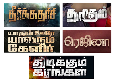
A typographic design is text-based, where the symbols or imagery are incorporated into the text without being represented as a standalone design. As shown in the Figure 2, the titles such as Theerkadarishi (symbol of a man, web, and magnifying glass), Thuritham (helmet and tyre marks), Yaadhum Oore Yaavarum Kelir (people’s protest and world map), Regina (profile of a women) and Thudikkum Karangal (man with a gun, individual gun and YouTube logo) are some examples of this category. In these examples, the symbols or imagery rather than being portrayed as a separate design, the symbols or pictures are integrated within the text.
Figure 2
|
Figure 2 Use of Decorative
Elements in the Film Titles (Typographic) Source Wikipedia |
4.1.2.2. NON-TYPOGRAPHIC DESIGN
Non-typographical design showcases a separate use of symbols or imagery without tweaking the font as seen in Figure 3. In the film, Vellimalai, the image of a sage is placed without disturbing the form of the letters. Similarly in the film Vaathi the nib of a pen is placed above the third letter, in Rippupbury the monkey symbols are placed above the second and the fourth letter, in Karungaapiyam the symbol of an eagle is placed above the title and in Thalaikkavasamum 4 Nanbargalum the helmet symbols are seen. These title card showcase symbols and imagery which do not integrate with the letterforms.
Figure 3

|
Figure 3 Use of Decorative Elements in the Film Titles (Non-Typographic) Source Wikipedia |
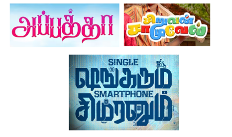
4.1.2.3. MIXED DESIGN
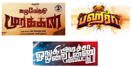
The mixed format enumerates the use of symbols or imagery within the text and also as a standalone form as seen in Figure 4 and Figure 5. In the film title, Bakasuran the dagger symbol is integrated with the third letter and the head crown of street performers is placed above the last letter. The letterforms of the film title Bommai is integrated with the silhouette of a woman’s head in profile. In the case of the film title Single Shankarum Smartphone Simranum, various symbols such as bitcoin, delivery boy riding bike, charger, Instagram icon, 4G symbol, microchip are placed as individual elements, whereas mute and string symbol are incorporated into the letters. In Bagheera the teddy bear with angry face and nuptial thread are placed as separate elements, but the profile of a woman is incorporated in the third letter. Similarly in the film Kazhuvethi Moorkkan and Oongi Adicha Ondra Ton Weightu Da individual and text integrated elements are seen.
Figure 4

|
Figure 4 Use of Decorative
Elements (Mixed Design) Source Wikipedia |
Figure 5
|
Figure 5 Use of Decorative
Elements (Mixed Design) Source Wikipedia |
4.2. SEMANTIC ANALYSIS
Meaning is the subject of semantics. It deals with the process of interpreting any symbol. This section examines the connection between the movie title and the story or theme of the picture. Under semantics analysis, there are 3 types. They are as follows:
4.2.1. TITLE DESIGN WITH REFERENCE TO MEANING OF TITLE
Figure 6 shows the title cards in which the letters have been randomly designed to correspond to the meaning of the title. In the case of the title Kannai Nambathey letterform is designed in an illusionistic way which reflects its meaning ‘don’t trust your eyes’. As shown in Figure 6, title cards of films like Vaathi, Kasethan Kadavulada and Kudimagan are some examples of this trend. In the title ‘Infinity’, the use of the infinity symbol echoes its literal meaning, whereas in the case of the title Kudimagan the form of letters showcases the look of a liquor bottle. It is amazing to see the letterform in the title Kasedhan Kadavulada where the use of Indian rupees symbol along with the image of Goddess Lakshmi are exactly related with the meaning of the title. In similar ways the use of the nib of an ink pen symbolises the meaning of the title Vaathi or teacher. This type of analysis highlights the striking rise in the title design's usage of expressive font, which aids in reflecting the title's meaning right away.
Figure 6

|
Figure 6 Film Titles Where
Letterforms Directly Relate with the Meaning of the Title Source Wikipedia |
4.2.2. TITLE DESIGN WITH REFERENCE TO FILM STORY
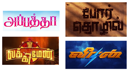
Titles are more aesthetically pleasing and meaningful owing to the designers' deft use of text-image pairings. As seen in Figure 7, predominantly the title composition and its meaning are successful in capturing the essence of the movie. Letterform structure was the primary tool used for exploration in order to reflect the story. Looking at the title design of the film Por Thozhil, it showcases strings that are connected randomly. This suggests the serial killer who kills the victim by strangulation. It also symbolises the way the cops work to connect the dots together to catch a serial killer on the loose. In the film title Appatha the letter forms are modified to represent the dog's bone and claws to reflect the bond between the grandmother and the dog. In Veeran the second letter is merged with a flash symbol to reflect the superpower plot in the film. Similarly in the film title Luckyman the third letter which is about to fall is held by the strings right under the figure of Guberan or God of wealth placed against the lucky spin wheel. Contradicting the meaning of the title, the elements actually reflect the plight of the central character in the film being unlucky since birth.
Figure 7
|
Figure 7 Film Titles Where the
Letterform Going with Central Theme of the Film Source Wikipedia |
4.2.3. LETTERFORMS BASED ON GENRE OF THE FILM
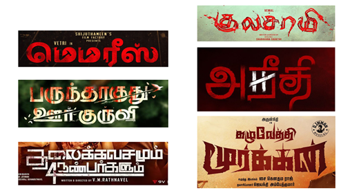
The majority of the films from the 55 examples gathered fit into one of the following main genres: historical, criminal, thriller, horror, drama, or comedy. Regardless of the genre of the movie, letterforms typically follow a similar pattern, using exterior components, perspective, shadow, texture, and contour to generate emphasis. Figure 8 showcases the film based on crime, horror, thriller, and revenge seeking and has used the letterform and design elements that are mostly in red color with sharp edges and also with texture of blood spots. The film based on epic and period stories like Ponniyin Selvan, August 14, 1947, Yaathisai and Harkara with the use of color theme and font styles establishes an impression of a historical and period genre as seen in Figure 9. On the other hand, the films based on drama and comedy reflect the genre with the use of bright colors and playful design elements as represented in Figure 10.
Figure 8
|
Figure 8 Title Cards Reflecting the Genre of the Film (Thriller) Source Wikipedia |
Figure 9

|
Figure 9 Title Cards
Reflecting the Genre of the Film (Historical) Source Wikipedia |
Figure 10
|
Figure 10 Title Cards Reflecting the Genre of the Film (Drama and Comedy) Source Wikipedia |
4.3. PRAGMATIC ANALYSIS
This section examines the title design in relation to production techniques. The work of designers and artists who delve deeper into the field of expressive typography pave the way for new age title design making culture in Tamil cinema. Figure 11 showcases the process of making a title design that includes research, sketches, colour options and finally converting into digital format.
Figure 11
|
Figure 11 Use of Decorative
Elements (Typographic) Source Wikipedia |
5. CONCLUSION
According to Roland Barthes, a sign has denotative and connotative meanings. The denotative meaning of the title designs analyzed are conveyed in the title themselves. The connotative meanings are implied through the use of decorative elements, tweaking of the typeface, color, positive and negative space, tone etc. These elements serve to be the signifiers of the title design. Case in point: the title designs that were very much unique, creative and had expressive typography, were less popular among the audience and sadly performed poorly in the box office. The analyses of the title designs reveal the usage of many varying structural elements that were rich in semantic, syntactic, and pragmatic. The expressive typography used in the title designs serve to be the attention grabbers and also drives the audience to watch the film in case they have not. The advancements in technology have been utilized at its best to feature the title designs and thus setting the bar higher.
CONFLICT OF INTERESTS
None.
ACKNOWLEDGMENTS
None.
REFERENCES
Chandler, D. (2006, November 4). Semiotics for Beginners: Signs. Princeton University.
Eco, U. (1976). Signification and Communication. In a Theory of Semiotics, 32–47. Indiana University Press.
Farah, J. (2023, October 11). A Deep Dive Into Movie Poster Design: Webflow Blog. Webflow.
Raman, S. (2019, November 1). The Real Poster Boys of Tamil Cinema. Times of India. Retrieved From 2023, September 15. The Real Poster Boys of Tamil Cinema.
Shahid, M., Bokil, P., & Kumar, D. U. (2014). Title Design in Bollywood Film Posters: A Semiotic analysis. In Smart innovation, Systems and Technologies, 291–301. https://doi.org/10.1007/978-81-322-2232-3_26
Wells, J. (2019). Typography | Definition, History, & Facts | Britannica. In Encyclopædia Britannica.
Yakin, H.S.M., & Totu, A. (2014). The Semiotic Perspectives of Peirce and Saussure: A Brief Comparative Study. Procedia - Social and Behavioral Sciences 155, 4–8. https://doi.org/10.1016/j.sbspro.2014.10.247
|
|
 This work is licensed under a: Creative Commons Attribution 4.0 International License
© ShodhKosh 2024. All Rights Reserved.