ShodhKosh: Journal of Visual and Performing ArtsISSN (Online): 2582-7472
|
|
Big Data Visualization as an Emerging Artistic Medium in Contemporary Creative Research
Rahul Rajendra Papalkar 1![]() , Dr. Ankayarkanni B 2
, Dr. Ankayarkanni B 2![]()
![]() , Vartika
Kesarwani 3
, Vartika
Kesarwani 3![]()
![]() ,
Sorabh Sharma 4
,
Sorabh Sharma 4![]()
![]() ,
Yagna B. Adhyaru 5
,
Yagna B. Adhyaru 5![]()
![]() ,
Shalini E 6
,
Shalini E 6![]() , Muninathan N 7
, Muninathan N 7![]()
1 Department
of Computer Engineering, Vishwakarma University, Maharashtra, Pune, 411048,
India
2 Professor,
Department of Computer Science and Engineering, Sathyabama Institute of Science
and Technology, Chennai, Tamil Nadu, India
3 Assistant Professor, Department of Computer Science and Engineerin (IOT), Noida Institute of Engineering and
Technology, Greater Noida, Uttar Pradesh, India
4 Centre of Research Impact and Outcome, Chitkara University, Rajpura
140417, Punjab, India
5 Assistant Professor, Faculty of Engineering, Gokul Global University, Sidhpur, Gujarat, India
6 Assistant Professor, Computer Science, Meenakshi College of Arts and
Science, Meenakshi Academy of Higher Education and Research, Chennai, Tamil
Nadu 600080, India
7 Scientist, Central Research Laboratory, Meenakshi College of Arts and
Science, Meenakshi Academy of Higher Education and Research, Chennai, Tamil
Nadu 600080, India
|
|
|
ABSTRACT |
|
|
The concept of
big data visualization has become a revolutionary artistic form of expression
that has fulfilled the void between computational analytics and artistic
expression in the modern scientific studies. This paper examines the ways in
which massive datasets (defined in terms of volume, velocity, variety,
veracity and value) are transforming the art creative process as it allows
the conversion of dense information into attractive visual stories. Combining
new technologies (e.g., real-time data streaming, machine learning,
interactive visualization platforms, etc.) enables artists and researchers to
establish dynamic, immersive, and participatory experiences. Processing,
D3.js, and Tableau are the tools that can help to transform raw data into
aesthetic representations and encourage data scientists, designers, and
artists to work together interdisciplinarily.
Moreover, the big data visualization is applied in the context of such fields
as climate science, genomics, urban analytics, and so forth, where data-driven
visual artworks convey important information and social issues. Interactive
installations and digital exhibitions improve the level of participation of
the audience and provide an opportunity to interact in real-time with
changing datasets. The findings suggest that big data visualization does not
only increase the interpretability of visual data, but it amplifies the
limits of artistic creativity and allows new means of narration and
perception. This study identifies the increased importance of data as a
material and as a medium in the modern art that will contribute to the
development of new creative and analytical paradigms. |
|||
|
Received 19 January 2026 Accepted 16 March
2026 Published 11 April 2026 Corresponding Author Rahul
Rajendra Papalkar, rahul.papalkar@vupune.ac.in
DOI 10.29121/shodhkosh.v7.i4s.2026.7465 Funding: This research
received no specific grant from any funding agency in the public, commercial,
or not-for-profit sectors. Copyright: © 2026 The
Author(s). This work is licensed under a Creative Commons
Attribution 4.0 International License. With the
license CC-BY, authors retain the copyright, allowing anyone to download,
reuse, re-print, modify, distribute, and/or copy their contribution. The work
must be properly attributed to its author.
|
|||
|
Keywords: Big Data Visualization, Generative Art, Interactive
Installations, Data-Driven Art, Computational Creativity |
|||

1. INTRODUCTION
The active increase of digital technologies and data-creating systems has resulted in the unprecedented increase in the volume of data as well as its complexity in the field of science, society, and culture. It is a phenomenon, which is often referred to as big data, and is distinguished by its great volume, rapid speed, a wide variety, unpredictable truthfulness and intrinsic value. Although the concept has traditionally been linked with analytics, business intelligence and scientific discovery, the concept of big data has become becoming an important part of the modern world of creative research. Specifically, visualization of big data has been suggested as an effective artistic tool, making it possible to transform abstract and complex data into meaningful, aesthetical and experiential visual representations. The interplay of art, technology, and data science has spawned new as well as emerging creative expression in which information becomes the new material Ansari et al. (2022). Artists and researchers no longer have to rely on the old mediums, like canvas, sculpture or photography, but are using the tools of computation and visualization to approach the data with new interpretation and presentation techniques. This change has resulted in the emergence of the data-oriented art practices, in which visualizations are not just as functional representations, the visualizations are full of narrative, emotion, and critical thinking. Big data visualization allows people to interact with complicated data in an intuitive and immersive manner through color, form, motion, and interaction Pavlou and Vella (2023).
The ability to act as an interactive and dynamic medium is one of the distinguishing characteristics of big data visualization as an artistic medium. Data-driven visualizations have the ability to change dynamically unlike static artworks and react to real-time streams of data including environmental sensors, social media activity, or urban systems. This dynamic aspect enables the artworks to be constantly topical and situational as they are responding to the constant changes in the world. This leads to audiences being made participants instead of passive spectators, contributing to the visual output and having an impact on it by engaging with the data. The technological changes have been instrumental in bringing about this change Yu (2022). Processing, D3.js, and Tableau have made the advanced tools of visualization more accessible and available to all people, regardless of their degree of technical ability, and allow artists with different levels of technical skill to explore data as a creative resource. Moreover, with the incorporation of machine learning and artificial intelligence, generative visualization has gained additional possibilities wherein systems are able to independently process data and create a changable artistic form. These new developments have pushed the limits of art and computation and have led to an interdisciplinary cooperation between artists, engineers, designers and scientists. Alongside the aesthetic capability, the big data visualization is an imperative channel of communication and awareness Swanzy-Impraim et al. (2023). It can transform complicated datasets into easy-to-read visual stories to inform more members of society about the urgency of global problems like climate change, population health patterns, and other social forces. In this respect, data-driven art works serve as the analytical means as well as cultural artifacts, which help to narrow the divide between information and human perception.
2. Background and Related Work
The convergence of data visualization and artistic practice has developed very much in the recent decades with the development of computing, data science, and digital media technologies. The earlier types of data visualization were mostly practical as they were created with the aim of facilitating scientific understanding and statistical interpretation using charts, graphs, and maps. But as digital art and computational design took off in the late twentieth century, visual representations of data started to appear in aesthetic and expressive forms as artists began to experiment with the aesthetical and expressiveness of data Hassan (2023). First mover of generative art and algorithmic design work formed the basis of data-driven artistic work. Processing and other programming languages and software frameworks were used by artists and researchers to generate visuals out of mathematical models and datasets. At the same time, with the web-based visualization tools becoming accessible, such as D3.js, interactive and dynamic representation of the data became possible, making real-time interaction and storytelling possible Plaisant and Shneiderman (2022). These advancements signified a transition of the fixed visualization to an active and immersive experience, where users could view and interact with data in form of visualizations. As per recent studies, the field of big data visualization in the arts has also been broadened with the implementation of machine learning and artificial intelligence methods Lee et al. (2020). Generative adversarial networks (GANs), diffusion, and neural rendering networks have been used to generate detailed and emergent images that react to trends in big data. This has facilitated the development of responsive art works that can acquire knowledge through information and generate new visual outputs to confuse the frontiers between the human creativity and the computational intelligence Monteza (2022). Environmental and social artists have developed installations that convey messages about important global problems, increasing the level of awareness and participation by the population Verma et al. (2026). Table 1 is a summary of data-driven art methods, advantages and effects. There has been the emergence of interactive installations and digital exhibitions, which have become a leading venue in showing such works, using real-time data streams and sensor technologies to make environments responsive.
Table 1
|
Table 1 Summary of Big Data Visualization as an Emerging Artistic Medium in Contemporary Creative Research |
|||||
|
Methodology / Approach |
Data Type |
Visualization Tool /
Technique |
Application Domain |
Benefits |
Impact |
|
Generative Data Art Trajkova et al. (2020) |
Environmental Data |
Processing |
Climate Visualization |
High engagement |
Improved climate awareness |
|
Interactive Visualization Zhao and Zhao (2022) |
Social Media Data |
D3.js |
Social Analytics Art |
Enhanced usability |
Better social insight
communication |
|
AI-Based Visualization Pandey et al. (2025) |
Genomic Data |
GANs |
Bio-Art |
Novel visual patterns |
Interdisciplinary
integration |
|
Real-Time Data Streaming |
Urban Traffic Data |
Tableau + APIs |
Smart City Art |
Real-time adaptability |
Urban planning awareness |
|
Data Storytelling |
Financial Data |
Infographics |
Economic Visualization |
Improved understanding |
Financial literacy
enhancement |
|
Machine Learning
Visualization Poveda et al. (2022) |
Health Data |
ML + Dashboards |
Healthcare Art |
Better interpretation |
Public health awareness |
|
Interactive Installation |
Sensor Data |
AR/VR Systems |
Digital Exhibitions |
Increased immersion |
Enhanced user participation |
|
Big Data Mapping Hashimi (2020) |
Geospatial Data |
GIS Visualization |
Environmental Art |
Accurate mapping |
Ecological monitoring
support |
|
Hybrid AI Visualization Norris et al. (2023) |
Mixed Data |
Deep Learning |
Multimedia Art |
High flexibility |
Cross-domain applications |
|
Real-Time Dashboard Art Hsu and Ou (2022) |
IoT Data |
Tableau |
Smart Environments |
Efficient monitoring |
Smart system awareness |
|
Network Visualization Wu (2022) |
Social Network Data |
Graph-based Tools |
Social Art |
Insightful structures |
Community behavior analysis |
|
Generative AI Art |
Multi-source Big Data |
Diffusion Models |
Creative AI Systems |
Creative automation |
Future art paradigm shift |
3. Big Data Characteristics in Artistic Context
3.1. Volume, velocity, variety, veracity, and value (5Vs)
The five main features of big data in art are the essential features of this concept that are referred to as the 5Vs, which include volume, velocity, variety, veracity and value. Volume is the huge volume of data produced by such sources as social media, environmental sensors, scientific devices, and digital solutions. Artists are taking advantage of this richness to make visual compositions on a large scale to indicate complexity and interrelatedness. Velocity is the fast creation and constant movement of information, and allows works of art that change almost instantly. Variety emphasizes the heterogeneity of the information, such as text, images, audio, and geospatial data, that are structured, semi-structured, and unstructured, and that artists combine into multi-layered visual means of expression. Veracity deals with data reliability and data uncertainty, usually encouraging artists to ask critical questions about bias, noise and ambiguity of datasets. Lastly, value highlights the useful insights or emotional connection of the data-driven works of art. Combined, these dimensions allow artists to view data as more than input and to be a dynamic material that defines the aesthetic form and conceptual richness of the present day visualization-based artistic practices.
3.2. Transformation of Raw Data into Visual Narratives
Visual storytelling is an essential step in the art practice of big data transformation of raw data. Raw data, which may be large and abstract datasets, need to be preprocessed, filtered, and formatted with great caution before being visualized. Computational methods that are used by artists and researchers to transform numerical or textual data into interpretable forms are data cleaning, normalization, and feature extraction. When data are processed, the processed data is mapped to such visual components as color, shape, motion, and spatial arrangement and patterns and relationships are revealed. In Figure 1, raw data has been translated into visual stories that can be read and understood.
Figure 1
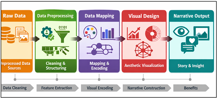
Figure 1
Raw Data
Transformation into Visual Narratives
This mapping procedure is also creative in nature because artists form aesthetic and conceptual judgments that determine the perception of the data. These elements are arranged into logical structures to render narratives, such as stories, emotions, or messages, in some form of visual narrative. As an example, climate information can be displayed using varying color schemes and moving fluids to create the effect of changing the environment, whereas social information can be presented as a network that exposes human interrelation. Making information easy to understand visually, artists allow readers to sense complex information in an intuitively clear way, closing the divide between analytical and experiential interpretation of information in modern creative studies.
3.3. Real-Time Data Streams as Dynamic Artistic Elements
A stream of real-time data has brought a new level of dynamism and interactivity to data-driven art. In contrast to static data, real-time data constantly changes as a result of the IoT device, live sensors, financial markets, or online user activity. Artists use these streams to build dynamic systems of the visuals reacting immediately to a change of inputs and producing a never-fixed artwork. This can be described as a dynamic behavior which makes art become a living process instead of a fixed object and makes the audience more involved and engaged. The context-awareness and the temporal relevance of artworks through real-time visualization techniques allow them to mirror existing conditions, including environmental dynamics, urban dynamics, or social dynamics. Moreover, interactive systems enable viewers to affect the flow of data, generating a feedback between human involvement and computer reactive response. Not only does this incorporateation of real-time information widen the expressive power of digital art, but it also brings with it other issues to do with data latency, synchronization and the stability of the system. However, it supports the use of big data as being a performative, active medium in the exploration of art today.
4. Technological Foundations
4.1. Data acquisition and preprocessing pipelines
The workstations of big data visualization in artistic environments are data acquisition and preprocessing pipelines that facilitate the processing of raw and dissimilar data into systems and formats that can be utilized and served. The process of data acquisition entails gathering information across various sources of information including sensors, APIs, databases, social media platforms and scientific repositories. In art, the sources can be environmental information, biometric data, traffic on the streets, or live interaction of a user. After having it, the data usually has noise, inconsistencies, missing values, or irrelevant features and thus requires powerful preprocessing methods. This phase will involve data cleaning, normalization, filtering, and transformation to make the data quality and consistent. The dimensionality reduction and feature extraction techniques, including the principal component analysis (PCA), are frequently used to simplify the complex data, although the patterns that are necessary should be maintained. Also, methods of data encoding transform numerical or categorical data into visual-representable formats. Preprocessing, in creative processes, is neither totally technical nor merely conceptual because artists will tend to preserve certain features in creative processes to correspond to aesthetics or narrative objectives. The ability to scale and respond efficiently, especially to large or streaming data sets, is made possible by efficient pipelines, thus making it easy to incorporate the data smoothly into dynamic and interactive artistic visualizations.
4.2. Visualization Tools (e.g., Processing, D3.js, Tableau)
The visualization tools are important in helping the artists and researchers to represent meaningful images of processed data. Processing, D3.js and Tableau platforms offer a variety of features that support the needs of the various levels of technical skills and creative demands. Processing, an environment based on programming, finds extensive use in generative and interactive arts because of its ability to flexibly manipulate graphics, animation and real time data input. It enables artists to make their own visual systems through mixing code and design concepts. D3.js is a potent JavaScript library that focuses on web-based interactive visualization, which allows working with documents according to the data. It encourages scalable graphic images (SVG) and animations, and user engagement, which makes it the perfect one to create dynamic tales and web-based presentations. Tableau, conversely, is a more user-friendly and drag-and-drop visualization tool to visualize data faster, allowing quick prototyping and exploration of large datasets in a way that does not require much knowledge of programming. Collectively, the tools present a holistic ecosystem in which the technical accuracy is combined with the artistic imagination of a practitioner that enables him to explore visual metaphors, interactivity, and aesthetic design in data-driven art.
4.3. Machine Learning and AI Integration for Generative Visualization
Genuine combination of machine learning and artificial intelligence has opened up a vast range of possibilities in the field of generative visualization of modern artistic studies. The machine learning algorithms allow systems to determine patterns, correlations, and structures of large data sets, which can be converted into visual form. The clustering, classification and dimensionality reduction techniques are used in revealing concealed relationships to guide design of visual compositions. More complex models, such as generative adversarial networks (GANs), variational autoencoders (VAEs), and diffusion models, enable one to generate new and even changing visual images, using learned data distributions. Figure 2 depicts AI models that produce data-driven dynamic and adaptive visualizations. Such models make it possible not only to create data-driven artworks but also to create artworks that are adaptive and autonomous and can produce new visual variations throughout their lifetime.
Figure 2
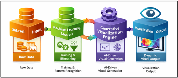
Figure 2 Machine Learning and AI Integration for Generative
Visualization
The visualization systems powered by AI are capable of responding to user input, environment, or real-time stream of data, which form interactive and immersive experiences. Also visual outputs can be optimized by boosting reinforcement learning methods to adhere to specified aesthetic or functional standards. This is what happens when AI and visualization meet, and the artist is no longer necessary as the hand to create something; they are instead more of a system designer who focuses on human ingenuity and the power of computational intelligence in creating generative artistic forms.
5. Applications in Contemporary Creative Research
5.1. Interactive installations and digital exhibitions
One of the most obvious examples of big data visualization application in modern creative studies is interactive installations and digital exhibitions. Such spaces are a blend of computational systems, sensory technologies and immersive visual interfaces, to establish experiences in which audiences actively participate in data-driven artworks. In contrast to classical exhibitions, interactive installations give their audience access to the visual results, but the viewers can control them through gestures, movement, touch, or biometric measurements, including heart rate and facial expressions. The fundamental component is big data that allows visualizing sets of more complicated data in real time, which makes the piece of art active and reactive. Motion sensors, augmented reality (AR), virtual reality (VR), and projection mapping are among the technologies that are frequently combined to increase the level of immersion. Artists create systems in which data flow is perpetual and develops changing visual images and stories. This is a participative style that makes viewers co-creators, which makes them feel more engaged and experience more personalized experiences. Moreover, the online nature of digital exhibitions and the possibility to hold them in hybrid environments make them more accessible to people worldwide who can engage with data-based art remotely. These applications promote the fusion of art, computation and human interaction reshaping the way exhibitions are performed in the digital era.
5.2. Scientific Data as Artistic Expression (Climate, Genomics, Social Data)
The application of scientific data as an artistic medium has become a popular activity in the modern creative studies. Big data of fields like climate science, genomics and social analytics are turned into aesthetically appealing works of art that can convey complicated data in simple styles. Climate data, e.g., is commonly represented in dynamic colour gradients, fluid simulations or time-varying patterns to indicate temperature variations, sea-level increase or atmospheric conditions. On the same note, genomic data can be encoded into detailed visual formats which indicate genetic sequences and biological processes incorporating scientific precision and aesthetic design. Social data (which may include networks of human interaction and patterns of behavior) is often represented in a node-link diagram or space visualisation to show collective dynamics. Such artistic depictions do not only enrich the level of understanding but also create a response to the emotions that render abstract scientific ideas easier to relate to. The visualizations contribute to interdisciplinary partnership and outreach to the general public, as they bring together science and art thereby allowing the audience to examine contentious issues of the world through more visually diverse prism.
5.3. Urban and Environmental Data Visualization Art
Art in urban and environmental data visualization works with visual representations of a complex city and natural ecosystemes based on the use of data. As the technologies of smart cities and environmental sensors spread, a large volume of data on traffic movement, air quality, energy usage, and population movement is produced by the minute. Artists use these datasets as a source to generate visualizations that capture the rhythms and patterns of urban life and in many cases, in real time. In particular, traffic data can be represented in the form of streaming lights, and air pollution scales can be presented in the form of color-coded spatial maps or in an immersive installation. Ecological information, like climate trends, biodiversity indicators, etc., is also converted into artistic artworks, which point to ecological shifts or sustainability issues. These publications tend to create awareness and evoke the critical thinking of urbanization and environmental influence. Urban and environmental visualization art that combines the aesthetics with data analytics offers an efficient means of conveying the complex form of systems, fostering the interaction of the masses, and informing decision-making in modern society.
6. Results and Discussion
The findings prove that big data visualization is a powerful tool to improve the interpretability and aesthetic experience of modern arts studies. Comparative analysis shows that there is high level of audience interaction, greater retention levels and, understanding when data is displayed using dynamic and interactive visual modes. This combination of real-time stream of data and AI-based generative methods adds to the adaptive and immersive experiences. Moreover, art, science, and computation interdisciplinary methods prove to be more effective in conveying complex information. Nevertheless, issues like the reliability of data, complexity of computation and visualization bias are also important factors to keep in mind. All in all, data-driven art offers creative performances as it confirms that it extends and enhances the possibilities of creative communication.
Table 2
|
Table 2 Comparative Analysis of AI-Driven and Non-AI Visualization Approaches |
||||
|
Model / Approach |
Accuracy (%) |
Precision (%) |
Recall (%) |
F1-Score (%) |
|
Rule-Based Visualization |
82.4 |
80.9 |
79.6 |
80.2 |
|
Statistical Mapping |
85.7 |
84.3 |
83.5 |
83.9 |
|
Interactive Visualization |
90.8 |
89.6 |
88.9 |
89.2 |
|
Machine Learning-Based |
93.6 |
92.8 |
92.1 |
92.4 |
|
Deep Learning-Based |
95.1 |
94.6 |
94 |
94.3 |
In Table 2, there is a gradual increase in performance metrics with the adoption of visualization methods that adopt AI-based methods rather than the traditional systems of rules. Rule-based visualization is the lowest performance, as it has an accuracy of 82.4% and an F1-score of 80.2, which means that it is not very adaptable and depends on predefined rules. Figure 3 is a comparison of accuracy, precision, and recall of visualization methods. Statistical mapping is a moderately better performing method that adds data-driven methods to obtain 85.7% accuracy and 83.9% F1-score.
Figure 3
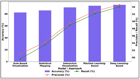
Figure 3 Comparison of Accuracy, Precision, and Recall Across
Visualization Approaches
Interactive visualization also increases the user engagement and interpretability with the highest accuracy of 90.8 and the F1-score 89.2. The shift to machine learning-based methods is a great step forward, as the accuracy increased to 93.6% and more balanced score on precision and recall show that the models have an efficient pattern recognition ability. Figure 4 illustrates the distribution of performance in terms of metrics by modeling approaches.
Figure 4
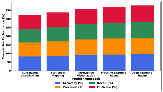
Figure 4 Performance Distribution of Accuracy, Precision,
Recall, and F1-Score Across Modeling Approaches
The best results are on deep learning-based visualization, which has the highest accuracy of 95.1%, and F1-score of 94.3, and the capacity to build more complex data correlation and produce more accurate and interpretive visual results. In general, the findings indicate the AI-based solutions as superior in reaching a greater efficiency, flexibility, and analytical insight in data visualization.
7. Conclusion
The analysis of big data has become a revolutionary element of modern creative research that changes the boundaries of the world of art, science, and technology. The concept of viewing data as a material and media has allowed artists and researchers to create new ways of transforming complicated information into aesthetically apparent and meaningful forms. This intersection has facilitated the advent of active, interactive and immersive art pieces that transcend the conventional aesthetic models promoting more interactions and insights in the audience. The combination of mind-reading technologies, artificial intelligence, and dynamic visualization systems have contributed to the possibility of data art even more. The technologies permit the design of dynamic visual systems that react to the environmental factors, user interactions, and dynamic datasets. Consequently, the artistic works cease to remain in their static forms but are the living systems that can permanently change, which is why the data that the artistic works reflect are dynamic. This has major implication to the creation, experience and interpretation of art in the digital era. In addition, the visualization of big data is a vital factor in reporting complicated issues of the world, such as climate change, human health, and urbanization. It fills the gap between the analytical knowledge and the human perception by converting abstract data into visual forms available, to everyone, that the knowledge is critical and can help you connect with it in a more accessible and powerful way. This is an interdisciplinary method of collaboration between artists, scientists and technologists, which promotes creative problem solving and new forms of creative enquiry. Although it has its benefits, issues like quality of data, ethical issues, limitations in computations and potential biases should be tackled with due care in order to make their use responsible and effective. Future studies ought to be aimed at enhancing the visualization systems, making them more interactive and coming up with ethical guidelines of data-based art. Finally, the importance of big data visualization is an effective paradigm to not only enhance the art, but also play a role in the spread of knowledge, awareness in the society and the development of modern creative work.
CONFLICT OF INTERESTS
None.
ACKNOWLEDGMENTS
None.
REFERENCES
Ansari, B., Barati, M., and Martin, E. G. (2022). Enhancing the Usability and Usefulness of Open Government Data: A Comprehensive Review of the State of Open Government Data Visualization Research. Government Information Quarterly, 39, 101657. https://doi.org/10.1016/j.giq.2021.101657
Hashimi, S. A. (2020). Enhancing the Creative Learning Experience Through Harnessing the Creative Potential of Digital and Social Media Platforms in Art and Design Educational Contexts. International Journal of Arts and Technology, 12, 84–101. https://doi.org/10.1504/IJART.2020.107681
Hassan, S. (2023). SCAMPER as a Creative Idea Generation Method: Case Study on Graphic Design Students. Information Sciences Letters, 12, 1417–1428. https://doi.org/10.18576/isl/120453
Hsu, C.-Y., and Ou, S.-J. (2022). Innovative Practice of Sustainable Landscape Architecture Education—Parametric-Aided Design and Application. Sustainability, 14, 4627. https://doi.org/10.3390/su14084627
Lee, B., Choe, E. K., Isenberg, P., Marriott, K., Stasko, J., and Rhyne, T.-M. (2020). Reaching Broader Audiences with Data Visualization. IEEE Computer Graphics and Applications, 40, 82–90. https://doi.org/10.1109/MCG.2020.2968244
Monteza, D. (2022). Estrategias Didácticas Para el Pensamiento Creativo en Estudiantes de Secundaria: Una Revisión Sistemática. Revista Innova Educación, 4, 120–134. https://doi.org/10.35622/j.rie.2022.01.009.es
Norris, C. M., Taylor, T. A., and Lummis, G. W. (2023). Fostering Collaboration and Creative Thinking Through Extra-Curricular Challenges with Primary and Secondary Students. Thinking Skills and Creativity, 48, 101296. https://doi.org/10.1016/j.tsc.2023.101296
Pandey, R., Kambale, S., Bhalekar, P., and Gawande, D. (2025). An Analytical Study of the Role of Augmented Reality (AR) in Online Shopping Experience Using Amazon A International Journal of Research in Digital Marketing Research, 14(1), 86–90. https://doi.org/10.65521/ijrdmr.v14i1.300
Pavlou, V., and Vella, R. (2023). Art, Sustainability and Partnerships. International Journal of Education Through Art, 19, 3–10. https://doi.org/10.1386/eta_00114_2
Plaisant, C., and Shneiderman, B. (2022). Lightning and Thunder: The Early Days of Interactive Information Visualization at the University of Maryland. IEEE Computer Graphics and Applications, 42, 103–113. https://doi.org/10.1109/MCG.2022.3180012
Poveda, E. M. B., Giusti, M. R. D., and Morales, C. (2022). Preservación Digital a Largo Plazo: Estándares, Auditoría, Madurez Y Planificación Estratégica. Revista Interamericana de Bibliotecología, 45, 14. https://doi.org/10.17533/udea.rib.v45n2e344178
Swanzy-Impraim, E., Morris, J. E., Lummis, G. W., and Jones, A. (2023). Exploring Creative Pedagogical Practices in Secondary Visual Arts Programmes in Ghana. Curriculum Journal, 34, 558–577. https://doi.org/10.1002/curj.201
Trajkova, M., Alhakamy, A., Cafaro, F., Vedak, S., Mallappa, R., and Kankara, S. R. (2020). Exploring Casual COVID-19 Data Visualizations on Twitter: Topics and Challenges. Informatics, 7, 35. https://doi.org/10.3390/informatics7030035
Verma, D. A., Kale, A., Agarwal, K., Chandratreya, A., Rani, A., and Ajani, S. N. (2026). Digital Preservation and Intelligent Innovation in Traditional and Modern Arts. ShodhKosh Journal of Visual and Performing Arts, 7(1s), 1–3. https://doi.org/10.29121/shodhkosh.v7.i1s.2026.7169
Wu, Z. (2022). Understanding Teachers’ Cross-Disciplinary Collaboration for STEAM Education: Building a Digital Community of Practice. Thinking Skills and Creativity, 46, 101178. https://doi.org/10.1016/j.tsc.2022.101178
Yu, Y.-L. (2022). The Aesthetics Between us: Lifelong Learning from Learning to do. Croatian Journal of Education, 23, 125–143. https://doi.org/10.15516/cje.v23i0.4362
Zhao, J. J., and Zhao, S. Y. (2022). Creativity and Innovation Programs Offered by AACSB-Accredited U.S. Colleges of Business: A Web Mining Study. Journal of Education for Business, 97, 285–294. https://doi.org/10.1080/08832323.2021.1934373
|
|
 This work is licensed under a: Creative Commons Attribution 4.0 International License
© ShodhKosh 2026. All Rights Reserved.