ShodhKosh: Journal of Visual and Performing ArtsISSN (Online): 2582-7472
|
|
EXPLORING THE DEPTH OF ELEMENTS AND PRINCIPLES OF VISUAL DESIGN
Rohit Kumar 1![]()
![]() ,
Shaila Naaz 2
,
Shaila Naaz 2![]()
![]()
1 Student,
SOAD KRMU, Haryana, India
2 Assistant
Professor, School of Architectural & Design, K. R. Mangalam University, Gurugram-122103,
Haryana, India
|
|
|
ABSTRACT |
|
|
This research
paper explains the fundamental and basic elements and principles of visual
design, which plays crucial/important role in creating the best and
aesthetically pleasing, visually appealing designs and compositions. This
paper tells us about the important understanding the basic design elements,
which is line, colour, shapes, textures and value. How we can easily make a
design by using these elements and principles, their significance in designs.
Also, how elements can be used in principles, there relationships. Principles
like harmony, unity, proportion, balance, rhythm, and repetition etc., their
role, importance in creating visual designs pleasing and eye-catching. This
paper provides insights into how different artists, designers have use these elements and principles of design in their work,
projects, along with the cultural and historical contexts that have
influenced their design choices. Overall, the paper emphasizes the
significance of these design principles, and how they can be used to create
meaningful, impact and memorable works of art and design. |
|||
|
Received 29 August 2023 Accepted 25 December 2023 Published 30 December 2023 Corresponding Author Rohit
Kumar, rohitkumar11332@gmail.com DOI 10.29121/shodhkosh.v4.i2
ECVPAMIAP.2023.709 Funding: This research
received no specific grant from any funding agency in the public, commercial,
or not-for-profit sectors. Copyright: © 2023 The
Author(s). This work is licensed under a Creative Commons
Attribution 4.0 International License. With the
license CC-BY, authors retain the copyright, allowing anyone to download,
reuse, re-print, modify, distribute, and/or copy their contribution. The work
must be properly attributed to its author.
|
|||
|
Keywords: Elements, Principles, Design |
|||

1. INTRODUCTION
Visual design, as a fundamental component of the artistic and communicative realm, encompasses a diverse array of principles and elements that underpin the creation of captivating and impactful imagery. From the subtle play of color to the strategic placement of elements, the world of visual design is a rich tapestry woven with the threads of balance, contrast, space, and numerous other elements. Understanding and exploring the depth of these principles not only enriches our perception but also provides a profound insight into the intricate mechanisms that guide our visual experiences.
This research embarks on a journey to delve into the very essence of visual design, aiming to unravel the nuances that govern its principles and elements. Through an in-depth examination of these foundational components, this paper seeks to shed light on the profound impact they have on the human psyche, communication, and the artistic process.
The significance of visual design extends far beyond mere aesthetic appreciation. Its principles are embedded in the core of various disciplines, from graphic design and architecture to digital interfaces and fine arts. By comprehensively exploring these principles and elements, this research aims to elucidate their application in diverse fields and how they influence human perception and interpretation of the visual world.
2. FINDINGS AND DISCUSSION
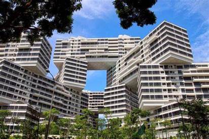
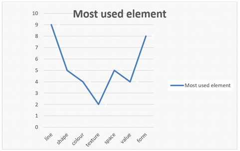
The basic structure of any design is the elements and principles which together form to make a unique design. Lines, shapes, space, texture and volume etc are the basic elements of visual design, which can together form to make a composition attractive. By repeating in order, it makes a certain kind of pattern which results in the principles of visual design. Repetition, pattern, rhythm, balance etc are the principles of design. The most simple element of visual design is line, which used to show the connectivity between various objects, things and emotions. Line with uniform and non- uniform thickness can convey different kinds of messages. It also indicates the directions, motions and movements. Repeating these lines can also make a different pattern Hashimoto & Clayton (2009). Designers use lines to show the connectivity between any two or more.
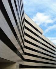
Line is used in designs in different-different manners, for example vertical, horizontal and diagonal lines.
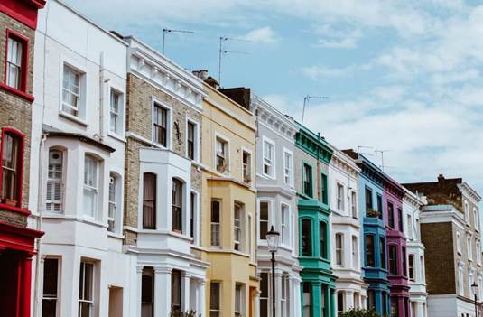
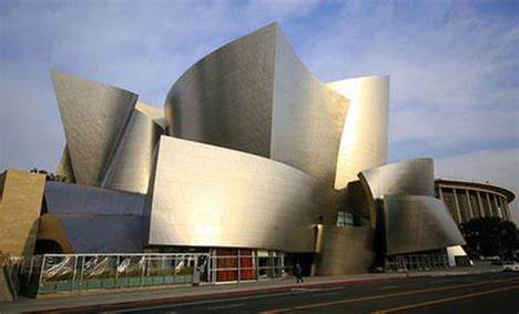
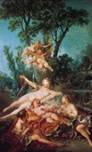
The arrangement of horizontal and vertical lines can create a sense of stability and order in a design, influencing the viewer's perception of balance Amir & Lobel (2017). The image below has vertical lines which indicate the balance. In logo design, the choice of lines and shapes plays a crucial role in conveying brand identity and messaging Borden & Sheridan (2019). The horizontal line gives some relaxation and steadiness in the composition. Artists use horizontal lines when they are required to show the steadiness of objects. Diagonal angle formed by lines gives a sense of motion and movements in the compositions. The image below indicates the diagonal lines in it which show the motion Hashimoto & Clayton (2009).
Figure 1
|
Figure 1 Source pxhere |
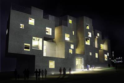
Figure 2

|
Figure 2 Source Photography Life |
The other element of visual design is the space. The manipulation of negative space is instrumental in defining the relationships between elements and creating a sense of clarity in design Haig (2019). Positive space refers to the space where the actual composition is formed, and the negative space is what the empty space is left. The proportion of negative and positive space must be checked in order to make a balance composition. Designers can use this positive and negative space in a creative manner so composition looks aesthetically beautiful. The utilization of depth and perspective in design adds a three-dimensional quality to visuals, influencing the viewer's perception of space and distance Hashimoto & Clayton (2009).
Also while designing a logo for a company, designers can use this element of design (negative and positive space), which create a sense of balance in composition.
Figure 3
|
Figure 3 Source i.pinimg |
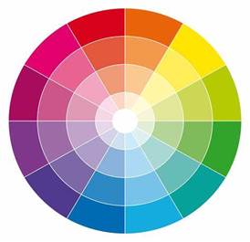
Colour
The third element of design is colour, colour theory defines the mixing and usage of different colours in composition and design. Colour can add the next level of aesthetic beauty, and energy to our design and also can convey emotions Gogel (2016). Colours which can’t be formed by any mixing of colour, hence they are called primary colours. The second one, is a secondary colour which can be formed by mixing two or more primary colours. For example, green, orange light blue etc. tertiary colours are those which can be made by mixing secondary colours like yellow-orange, blue-violet etc.
Figure 4
|
Figure 4 Source Justpaint. |
Figure 5
|
Figure 5 Source thinkaec. |
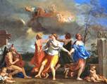
Realism
It is the way we observe images and textures, without interference in its actual proportions and lighting Hashimoto & Clayton (2009). Hence everyone in the audience can relate it in the real world. There is neither any type of distortion nor exaggeration.
It helps to make image as realistic, anyone can relate the object in the real world. For example, a drawing/painting of fruit, a mountain etc can easily be understood that it is a mountain or an apple. In today’s world, mass communication uses realism in a greater extent to relate their message with the help of images, it helps to set up the relation between the object in paper and in reality Gogel (2016). Realism is different from distortion because it maintains the overall composition of the image as it looks natural not artificial or exaggerated, modified.
In this painting, a rising sun in a valley between mountain and a river gives a sense of positivity and relaxation. This painting can easily be related with the actual, real-world because there is no distortion or exaggeration.
Figure 6

|
Figure 6 Source reference.com |
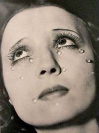
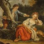
Distortion
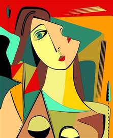
When real shapes and object in painting/drawing are changed, exaggerated or manipulated but still they are identical and relatable as real/natural objects. For example in this painting, the distorted woman gives a message of sadness, unhappiness, depression. Thus convey a message of some unwanted/sad moment happening which results in depression. Distortion is nothing but the process of manipulating and modifying the actual image to such an extent when it communicates the hidden message which artist wants to give so Goodman (2017).
These type of painting/images used in horror movies, animation poster and promotions Which helps to convey the message that the film is horrific and fearful.
Figure 7
|
Figure 7 Source connorheskethphotograph |
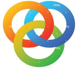
Abstraction
It is nothing but a process of minimizing and reducing the object and shapes down to the simplest form, so easy to understand Hashimoto & Clayton (2009). Symbols, logos, trademarks, and many other company stamps are made up of using abstraction. Signs which include road signs, buttons on the remote, panels, phone buttons, and application symbols are the perfect examples of abstraction. Because it helps to minimizing the pictographic representation of things into their minimum form. Audiences can easily understand the message which can be conveyed through these symbols, signs and trademarks. The incorporation of abstract color schemes challenges traditional color associations, prompting viewers to focus on emotional responses rather than literal interpretations Goodman (2017).
Logo Designers and artists, visual designers use abstraction to communicate with the audience with the use of the minimal amount of shapes, objects and colours which gives a maximum amount of information Hashimoto & Clayton (2009).
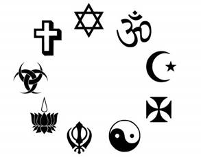
In this image, three circles interlocking with each other symbolises the unity, relation and interlocking between two or more things, person, place or objects. By this logo, the designer creatively gives a message of unity and interdependency among various things the in universe which we see, like air and human, water and oxygen, food and hunger etc. In the second image, signs of various religions denoting different kind of religion themselves independently. Simply “swastika” denotes Hinduism, “cross” denotes Christian and “star & half moon” denotes islam. These are the perfect examples of abstraction.
Non-objective
When shapes have no apparent visual representation of anything in nature. In the first figure, objects have no such identity the in real world but look quite impressive.
Figure 8
|
Figure 8 Source c8.alamy |
Rectilinear shapes
This form of art popularised during industrial revolution in 18th century, they show the social issues and society of that time. Futurism, constructivism, cubism and art deco are the some arts which also have great popularity during these time adopted by new world of mass production and machines.
Figure 9
|
Figure 9 Source cliparts.co |
Figure 10
|
Figure 10 Source i.pinimg |
Figure 11
|
Figure 11 Source i.pinimg |
Figure 12
|
Figure 12 Source i.pinimg |
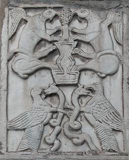
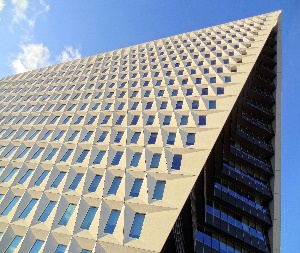
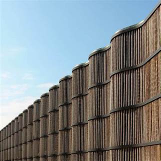
3. CURVILINEAR SHAPES
Shapes that are organic, curved and round. It relies on the life forms present in nature.
Figure 13
|
Figure 13 Source cliparts |
Figure 14
|
Figure 14 Source cliparts |
These are the examples of curvilinear shapes. Observe the edges, they are curved as compared to the rectilinear whose edges are sharp.
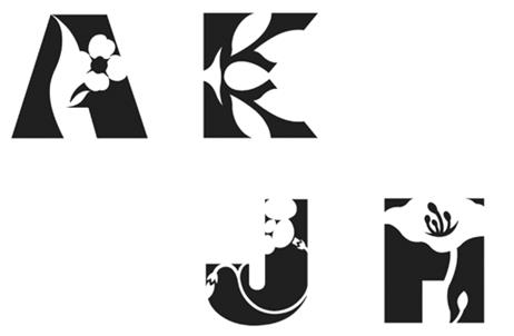
Negative space
Empty area around a positive shape. The association between shape and space is termed figure/ground Lidwell et al. (2010). The figure represents the positive shape, while the surrounding area constitutes the negative space. Designers uses this relationship very uniquely thus gives perfect results. In order to separate the boundaries of positive shape, negative space also plays a very important role Hashimoto & Clayton (2009). The balance between these two, creates a good composition. In some designs, the actual boundaries of positive shapes is not so clear or mix-matches with the background which becomes difficult for the audience to understand what message this composition gives.
The strategic arrangement of white space in print advertising influences reader engagement and comprehension by providing visual breaks and enhancing readability Tufte (2001). In order to grasp the negative space completely, it is essential to establish the surface boundaries of a design. This space is often referred to as the picture frame. Without picture frames, the positive shape may blend into the entire page or background. Hence, the composition becomes confusing and less attractive. Thus affect the entire design.
In this image, the figure/ground confusion is clear. In these alphabets, black colour denotes positive shapes and white colour is negative space.
The concept of visual depth is crucial in digital interface design, where the effective use of space can simulate a three-dimensional environment Amir & Lobel (2017). Thus clear the confusion between what is actually seen and what is in real. Some of the compositions have an absence of this balance which creates them very confusing. In the next picture, one can easily relate how the picture frame can easily affect the entire design and composition.
Figure 15
|
Figure 15 Source i.pinimg |
Figure 16
|
Figure 16 |
Volume
Figure 17
|
Figure 17 Source i.pinimg |
Volume characterizes three-dimensional visuals that possess length, width, and depth Hashimoto & Clayton (2009).
It is used by many designers, logo makers, architects and artists to give 3D looks, realistic objects etc. The study by Ambrose & Harris (2019) explores how the manipulation of volume in typography can enhance the visual hierarchy and overall readability of text. it helps to understand the basic structure of the object in reality or the real world.
Value
Value simply define the the dark and light It relies on light; without it, value ceases to exist. Light enables the perception of the contrast of values that constitute shape and form. A design with extreme value contrast provides a sense of clarity and depth. Similar value may give a sense of subtlety.
In this image, light and dark values can be easily seen on the face of the object. It also indicates the direction of light and shadow. The area with a dark value shows shadow and the low value shows the area where the light falls. In some images, there is difficulty in understanding the proper light and shadow of the object. The actual object is seen as a shadow. Higher contrast results in bad composition.
Figure 18
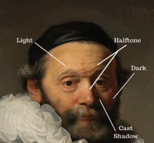
|
Figure 18 Source i.pinimg |
This concept is also used in photography, where the photographic triangle. ISO of the camera decides the amount of light required. In darker areas higher the iso level and vice versa.
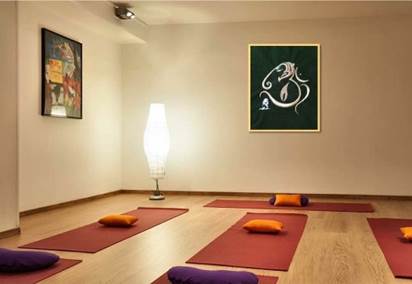
Designers use value as their mood-changer element, lighter value suggests a brighter, happier mood, and a certain kind of relaxation. The darker the value indicates, sadness, sorrow and seriousness Caraballo & Cline (2018).
In yoga or rehabilitation centre, we usually notice lighter paints. It calms the mind and relaxes our mood.
Unity or harmony
Figure 19
|
Figure 19 Source i.pinimg |
It expresses the sense of belongingness or interdependency of one object over another. Harmony has the same meaning as unity. Unity can be achieved by various means like repetition, continuation and placement Heller & Talarico (2014). The principles linked to unity can be extended to any element of visual design, such as line, shape, and value.
see how shapes are connected together in unity, thus giving good vibes from the composition.
Figure 20
|
Figure 20 Source adobe |
Unity can be achieved by arranging of elements next to each other. In newspaper, books, magazines etc, we see how the paragraphs, and information are organised in such a way that create a relationship between various events or information. The arrangement of lines or text in relation to each other can influence the overall appearance, value, and readability of a paragraph. The gap between each line of text is known as leading. When the lines of text are closer together, or when there is less leading, the paragraph's shape appears denser and darker.
Unity with shapes
Generally, artists and designers use unity in shapes, as shapes far from each other form weak relationships to each other, and those closer to each other form strong relationships between them. We can use this for creating headings, also letter far apart gives a slower or calmer feeling which we can use for describing the time extent. As letters closer to each other, a fast-paced feeling can be achieved. In visual design distance is directly proportional to time, hence we generally see spaced letters when we’re talking about the timeline. Larger the distance, more the time taken for recognize.
Figure 21
|
Figure 21 Source listcarbrands |
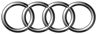
Audi is also a best example of Gestalt theory, in which similar circle grouped together to form a design.
Figure 22
|
Figure 22 Soure Artranked |
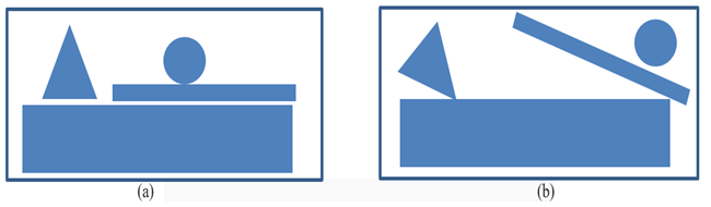
By picking up random shapes and arranging them can seem active and fun, but if they are not arranged in proper manner it does not recognize by audience. Composition which have proper arrangement of shapes delivers a visual message quickly.
Figure 23
|
Figure 23 |
In the left image, we see how faster it gives a message and looks good as compared to the right-sided image, hence proper arrangement of random shapes is necessary for making it easy to recognize the image.
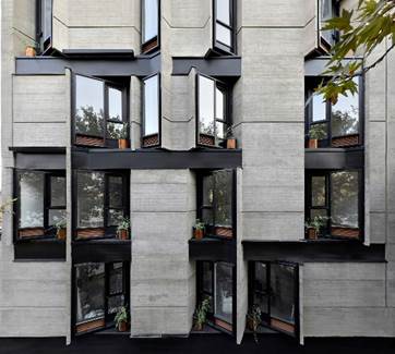
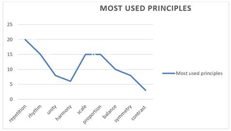
Repetition
Repetition is a second principle of visual design, lines, shapes repeat to form a pattern thus creating unity. Unity can be achieved by repetition in lines and shapes as discussed above. Using the same direction for lines repeatedly can establish a connection between all elements of a design. As we discussed shapes are of two types rectilinear (sharp edges) and curvilinear (round edges).
Figure 24
|
Figure 24 Soure Artranked |
In first image we see, repetition with curvilinear edges, in second image with rectilinear and in last one, combination of both. Designers make their design either by using of rectilinear or curvilinear shapes, or by a combination of both. It will create communication with the design and the audience Caraballo & Cline (2018).
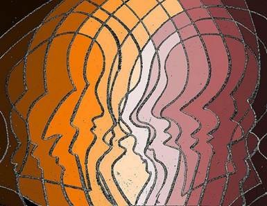
Rhythm
The next principle of design is rhythm, which creates by repeating similar or different shapes and lines in a predictable manner Hashimoto & Clayton (2009). Sometimes people confuse with repetition and rhythm but they are different. Rhythm relies on a precise replication of elements, using repetition to generate a sense of predictability and pacing. However, in repetition, we merely duplicate lines and shapes to form a pattern. There are two distinct types of rhythm: alternating and progressive rhythm.
Figure 25
|
Figure 25 Source i.pinimg |
In alternating rhythm, two distinct elements are utilized and repeated in an alternating fashion. Conversely, progressive rhythm depends on a gradual evolution within a repeated series of elements.
These elements change from each other with size or weight. It can be bigger or smaller in size.
Figure 26
|
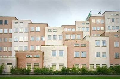
Figure 26 Source bp.blogspot |
In first image we see progressive rhythm, as we see lines are different from each other in terms of their sizes & weight. In second image, we noticed the alternating pattern of buildings.
Unity using value
Unity is attainable by employing consistent values in design. As we discussed earlier, value denotes the darker or lighter. Lighter values uses to create a relationship between them and darker value to create contrast. It makes the design heavier.
In this image, lighter and darker values use to create a sense of relation and unity throughout the composition. It has different values.
Figure 27
|
Figure 27 Source i.pinimg |
Unity and continuity
Continuity is based on the concept that an element is extended or linked to another. A common example of this is the use of a grid or guide to arrange information and images in magazines, books, and websites.
Variety
Variety and unity are the two different ways to enhance the design. Unity attempts to link together various elements like shapes, lines etc by establishing a certain kind of relationship between these two. But so much of unity becomes boring over time, we need some kind of contrast whether it is shapes or any kind of contrast. Variety introduces this contrast into the design Pahwa (2020). Both of these principles are applicable to any or all design elements. Artists and designers create compositions by finding a balance between them. Much variety also leads to look composition being unbalanced and confusing and so much of unity also becomes boring. Hence find a perfect balance. Variety can be created by lines, shapes and colour. By using lines with different line weight leads to contrasting elements in a composition. Shapes can generate interest through diverse forms of contrast. They might differ in size or visual prominence. Visual weight represents the sensation of an element being either heavy or light, contingent on the attention it garners. Larger shapes typically convey a sense of heaviness compared to smaller shapes. Visual weight is commonly associated with visual size, yet it can also pertain to the value of a shape. In the image below see, how visual weight is influenced by value Hashimoto & Clayton (2009).
When all elements possess diversity and distinctiveness, it leads to chaos and disarray. Variety needs to be combined with unity to produce a successful design. Achieving interest requires a blend of harmony, similarity, and diversity. It's the responsibility of the designer to harmonize these two principles. A design can accentuate either unity or variety.
Figure 28
|
Figure 28 Source adsttc |
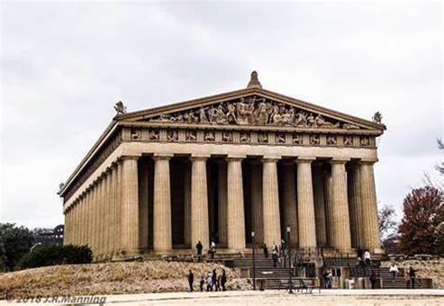
Balance
As we always hear that we should maintain balance in our lives, either it is professional or personal, studies, health, wealth everything. Because unbalance things feel so uneasy and uncomfortable. Similarly while composing a design, designers must maintain balance in their designs. All the heavy contrasting element should not be placed on one side, it feels uneasy and unbalanced Heller & Talarico (2014). Thus for achieving natural feelings, one should balance the elements in your composition. Designs employing highly contrasting elements are labeled as asymmetrical. Symmetrical balance imparts a sense of stability and enduring appeal, known as classical balance. Both symmetrical and asymmetrical designs incorporate a fulcrum to attain balance, serving as a line of symmetry.
Balance are of two types, one is symmetrical and the other is unsymmetrical balance centre balancing point, to. When both side of the design is same then it is called symmetrical balance, and if not then it is called asymmetrical c
Figure 29
|
Figure 29 Source Daily Forest |
Figure 30
|
Figure 30 Source tse4.mm.bing.net |
Another kind of balance is radial balance. It's defined as balance that emanates from a central focal point. This form of balance is frequently employed when a dynamic focal point is needed.
Figure 31
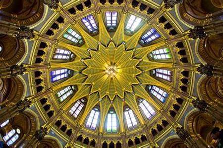
|
Figure 31 Source tse3.mm.bing.net |
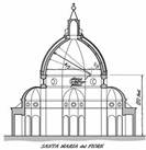
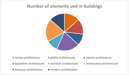
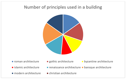
4. OBSERVATIONS
Table 1
|
Table 1 Uses of Elements and Principles of Visual Design in Architecture of
Different Time-Periods |
|||||
|
S. No. |
architecture |
Building |
Time-period |
elements |
Principles |
|
1 |
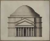
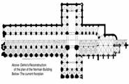
Roman architecture |
|
44 BCE to 476 CE |
Lines Space Shapes colour |
Repetition Scale Proportion Symmetrical balance Rhythm |
|
2 |
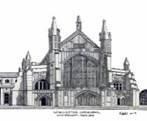
Gothic architecture |
|
(1100 AD TO 1450 AD) |
Lines Shapes Texture colour |
Scale Proportion Symmetrical balance Unity with shapes. |
|
3 |
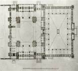
Islamic architecture |
|
600 A.D TO 1200 A.D.) |
Lines Texture Shapes |
Contrast Asymmetrical balance Unity with shapes |
|
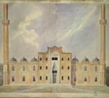
4 |
Byzantine architecture |
|
(A.D. 527 and 565) |
Lines Shapes Hemispherical domes Colour space |
Symmetrical balance Unity with shapes Scale Proportion |
|
5 |
Christian architecture |
|
(373 AD TO 500 AD) |
Lines Diagonal lines Shapes |
Symmetrical balance Scale Proportion repetition |
|
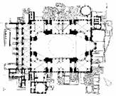
6 |
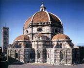
Renaissance architecture |
|
(1400 AD TO 1600 AD) |
Shapes Lines Textures Colour Space Arches. |
Unity with shapes Scale Symmetrical balance Proportion Repetition |
|
7 |
Baroque architecture |
|
(1600 AD TO 1830 AD) |
Lines Textures Shapes Space |
Symmetrical balance Scale Proportion Repetition Rhythm Contrast with shapes |
|
8 |
Modern architecture |
|
1830 A.D. TO TILL PRESENT.) |
Lines Shapes Space Semi-circular structures in facade |
Asymmetrical balance Scale Proportion Repetition Rhythm |


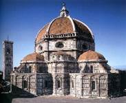
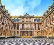
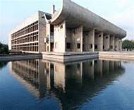
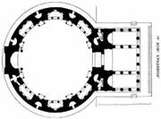
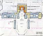
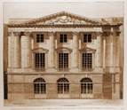
Table 2
|
Table 2 Use of Elements and Principles of Visual Design in Plan and Elevation of Buildings in Table 1 Time-Periods. |
||||||
|
Time-period |
Building |
Plan |
Elevation |
Element |
Principles |
|
|
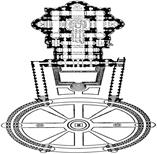
44 BCE to 476 CE |
|
|
|
Lines: Vertical. Horizontal. Shapes: Circular. Triangle. Cylindrical. Textured walls. |
Unity with shapes. Contrast with shapes. Repetition. Scale. Proportion. Symmetrical balance. |
|
|
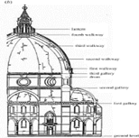
(1100 AD TO 1450 AD) |
st.
peter basilica. |
|
|
Lines. Shapes. Hemispherical dome. Semicircular arches. Rectangular and circular plan. Cylindrical pillar. |
Unity with shapes. Variety. Scale. Proportion. Symmetrical balance. Pattern. Contrast with shapes. |
|
|
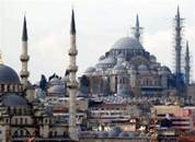
600 A.D TO 1200 A.D.) |
|
|
|
Lines. Square plan. Circular pattern. Hemispherical dome. Semi-circular arches. Colour. |
Repletion. Asymmetrical balance. Harmony. Contrast with shapes (large dome). Symmetry. Unity. |
|
|
(A.D. 527 and 565) |
|
|
|
Lines. Shapes. Semicircular window arches. Hemispherical dome. Square plan. |
Symmetrical balance. Unity. Repetition. Rhythm. Variety of shapes. Scale. Proportion. |
|
|
(373 AD TO 500 AD) |
|
|
|
Lines. Shapes. Cross shaped plan. Space. |
Symmetry. Symmetrical balance. Repetition. Scale. Proportion. |
|
|
(1400 AD TO 1600 AD) |
|
|
|
Lines. Shapes. Square plan. Hemispherical dome. Texture. |
Contrast with shapes. Symmetry. Symmetrical balance. Repetition. Rhythm. Unity. |
|
|
(1600 AD TO 1830 AD) |
|
|
|
Lines. Space. Colour. Shapes. Rectangular plan. |
Repetition. Symmetry. Rhythm. Symmetrical balance. Harmony. Scale Proportion Space Unity. |
|


|
S.no. |
architecture |
No of elements used |
No. of principles used |
Impact on design |
|
1 |
Rococo
architecture |
Lines Shapes Texture Space Colour value |
Repetiton Balance Unity Rhythm Scale
proportion Contrast Harmony Variety |
More
detailed. More
visually and aesthetically appealing. Decorated. Grandeur. Luxury
feeling. |
|
2 |
Islamic architecture |
Lines Shapes Texture Colour space |
Repetion Balance Unity Rhythm Scale
proportion |
More fined. Balanced. Symmetrical. |
|
3 |
Renaissance
architecture |
Lines Shapes space |
Scale
proportion Unity Repetition Rhythm |
Balanced. Symmetrical. |
|
Hence, more
number of elements and principles used gives more detailed and visually
appealing design. |
||||
Table 3
|
Table 3 |
||||
|
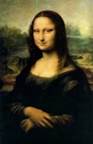
S. No. |
Painting |
Time-period |
Elements |
Principles |
|
1 |
renaissance painting |
1503-1504 A.D. |
Curvy lines. Value. Colour. |
Harmony. Balance. Variety. Emphasis. Proportion. |
|
2 |
Rococo painting |
1730-1760
A.D. |
Lines. Textures. Value. Colour. |
Movement. Contrast. Proportion Light and shadow. |
|
3 |
baroque painting |
1600-1700 A.D. |
Curvy lines. Convex and concave lines. Textures. Colour. Value. |
Contrast. Movement. Realism. Proportion. |
|
4 |
Romanesque painting |
1000-1100
A.D. |
Bright
colours. Curvy
lines. Value. |
Proportion. Asymmetrical
balance. Asymmetry. Variety. |
|
5 |
Gothic
painting |
1100- 1500 A.D. |
Value. Dark colour. Light and shadow. |
Proportion. Movement. Asymmetrical balance. Asymmetry. Contrast. |
|
6 |
romanticism |
1720-1900
A.D. |
Line Colour. Textures. Value. |
Emphasis Proportion. Contrast. Proportion. Movement. |


CONFLICT OF INTERESTS
None.
ACKNOWLEDGMENTS
None.
REFERENCES
Ambrose, G., & Harris, P. (2019). Basics Graphic Design 01: Approach and Language. Bloomsbury Visual Arts.
Amir, R., & Lobel, T. (2017). The Role of Color in Visual Communication. Routledge.
Borden, G., & Sheridan, M. (2019). Graphic Design Theory: Readings from the Field. Bloomsbury Publishing.
Caraballo, L., & Cline, M. A. (2018). The Principles of Design. Routledge.
Gogel, R. P. (2016). Principles of Design: A Handbook of Visual Communication. Routledge.
Goodman, E. (2017). Dynamic Diagrams: The Visual Language of Strategy. Routledge.
Haig, M. (2019). Brand Identity in Graphic Design. Bloomsbury Publishing.
Hashimoto, A., & Clayton, M. (2009).
Visual Design Fundamentals : A Digital Approach.
Heller, S., & Talarico, L. (2014). The Design Encyclopedia. Chronicle Books.
Lidwell, W., Holden, K., & Butler, J. (2010). Universal Principles of Design: 125 Ways to Enhance Usability, Influence Perception, Increase Appeal, Make Better Design Decisions, and Teach Through Design. Rockport Publishers.
Pahwa, A. (2020). The Ultimate Guide to Design Principles.
Tufte, E. R. (2001). The Visual Display of Quantitative Information (2nd Ed.). Graphics Press.
|
|
 This work is licensed under a: Creative Commons Attribution 4.0 International License
© ShodhKosh 2023. All Rights Reserved.