ShodhKosh: Journal of Visual and Performing ArtsISSN (Online): 2582-7472
|
|
COVER DESIGN, FILM POSTER, AND SUBTITLES: SEMIOTICS OF PARATEXTS IN SELECTING PARODIES
T. Sugadev 1![]()
![]()
1 Assistant
Professor of English, B.S. Abdur Rahman Crescent Institute of Science and
Technology, Vandalur, Chennai & Ph.D. Research Scholar, Department of
English, University of Madras, Chepauk, India
|
|
|
ABSTRACT |
|
|
A literary text becomes complete only when all its linguistic components are seen together to form meaning. French literary theorist Gerard Genette introduced a term called ‘Paratext’ to identify the additional parts of a text like subtitle, prefaces, introductory notes that contribute meaning to the text. A parody is generally understood as a work or performance that imitates another work or performance with ridicule or irony. In the field of literature, a parody comes with the effective imitation of the content of the parodied work in a satirical and ironical way. Paratext also attributes a lot in detailing the imitation of a work which fulfills the nature of parody from cover to cover. The relationship between a paratext and a parody can be better understood from a semiotic perspective. When paratexts are considered as linguistic, cultural, and contextual signs, they make the reader acquainted to the text. Hence, this research paper analyses the semiotic significance of paratexts in selecting parodies with reference to cover design, cover illustrations, subtitles, and film posters of select parodies. |
|||
|
Received 18 November 2022 Accepted 04 January 2023 Published 10 January 2023 Corresponding Author T.
Sugadev, sugadevthalapathy@gmail.com DOI 10.29121/shodhkosh.v4.i1.2023.269 Funding: This research
received no specific grant from any funding agency in the public, commercial,
or not-for-profit sectors. Copyright: © 2023 The
Author(s). This work is licensed under a Creative Commons
Attribution 4.0 International License. With the
license CC-BY, authors retain the copyright, allowing anyone to download,
reuse, re-print, modify, distribute, and/or copy their contribution. The work
must be properly attributed to its author.
|
|||
|
Keywords: Semiotics, Paratexts, Parodies, Paratext as Sign,
Subtitles, Cover Design |
|||


1. INTRODUCTION
Language, apart from human communication, is a medium used for business transactions, education, exploration, knowledge dissemination, constitutional purposes and freedom of expression of one’s thoughts and varied emotions. Samuel Johnson rightly said that “Language is the dress of thought”. Literature is a collection of thoughts expressed artistically through a language. Both literature and language are inseparable and compliment to each other. Expressing one’s thoughts with an artistic style paves way for the literariness and thus a literary creation.
The purpose of the language in a text extends beyond the content or the subject of a text. A text becomes complete only when all its linguistic components are seen together to form meaning. Hence, a text, apart from its main content, is made up of words that give it a suitable title, subtitle, prefaces, introductory notes, special addresses, epilogue, and other additional features like font style, colour, cover images, and the blurb in the back cover of the book. The sub-linguistic element that partly functions to be a part of the content of any text actually has a room of its own. These additional parts of a text either stand as a whole or as an independent element in order to contribute meaning to the main text. In short, all these sub-linguistic additional components and features are referred by a single label ‘Paratext’ by the French literary theorist Gerard Genette.
2. ParatexT
According to Gerard Genette, things like the title,
subtitle of the work, name of the author, preface, introduction, and
illustrations that accompany the text in a published work is referred to as
paratext. Paratexts are the manifold marginal texts in a
literary work that surround and influence the way the work is read. To him, a
text is accompanied by a certain verbal or other productions such as an
author’s name, title, preface, and illustrations. These accompanying
productions are called ‘paratexts’. In his own words, “the paratext is, rather,
a threshold, or - a word Borges used
apropos of a preface - a “vestibule” that offers the world at large the
possibility of either stepping inside or turning back” (Genette, 2). Thus, he
refers to ‘paratext’ as the ‘threshold’ that functions as a boundary of a
literary text that mediates between the world of publishing and the world of
the text. Genette & Lewin (1997), Genette & Maclean (1991)
Oxford Dictionary of Critical Theory defines paratext as a
term for the framing devices such as blurbs, subtitles, and celebrity
endorsements that authors and publishers use to contextualize works and
generate interest among readers. Further, it adds that though it is not
officially part of the text, the paratext can have a significant influence over
the way a text is received. The paratext is the sum of the peritext and
epitext. Peritext includes ‘inside-the-text-elements’ like titles, chapter
titles, prefaces, and notes while epitext includes interviews, publicity
announcements, reviews by critics, private letters, authorial and editorial
discussions, ‘outside’ of the text in question. Buchanan
(2010)
Each and every element of the paratext turns itself to be a sign and contributes meaning to the main content of that text. Therefore, each paratext is to be seen as a sign that has a signifier and a signified. For instance, if a subtitle of a work is taken as a sign, then the words in the subtitle stand as the signifier and the ‘title’ which the subtitle refers to is the ‘signified’. In the case of books, a subtitle function to be one among the chief paratexts. In advertisements, a caption of the logo or a slogan of the product serves to be a paratext. Therefore, in both the cases, paratext serves to be a marketing sign for selling the book or the product. Thus, a paratext becomes the brand signifier in order to promote the product (book). A simple tagline ‘Best-seller of the year’ or ‘Best-selling author of the year’ acts as a paratext in the promotion of the book. Thus, this research paper elucidates with example how paratexts serve to be an indispensable sign that contributes meaning to the text itself.
3. Subtitles
Subtitle is an act of titling in order to provide an explanatory title or more simply an alternative title to the original title of the work. During Elizabethan era, the practice of using a subtitle for plays was considered fashionable. It was William Shakespeare who parodied this trend by giving ‘What You Will’ as the subtitle for his romantic comedy Twelfth Night implying that the subtitle can be anything the audience wishes it to be. It is obvious that Shakespeare’s choice of subtitle in this case is deliberately uninformative and therefore parodies the purpose of it. Gerard Genette says the principal feature of subtitle is to more or less explicit inclusion of a genre indication of the work. A very famous example of this type includes Charlotte Bronte’s Jane Eyre: An Autobiography which was published in 1847 under her pseudonym ‘Currer Bell’. Apart from the genre indication, some other functions of subtitle are to provide an alternative title considering it to be a fashion, to give an explanatory note on the title, to be informative, to reveal the theme of the work, or simply to advertise and create curiosity among readers. One such example of using subtitle to reveal a theme is Modern Prometheus, the subtitle of Mary Wollstonecraft Shelley’s 1818 Gothic novel Frankenstein which indicates the ‘Greek Titan’ as a reference to the novel’s themes.
Subtitles became a common feature of English literary
works of 17th and 18th centuries. Subtitles made a more serious moral point
even in comics in 18th century. In the context of literature, the subtitle of a
work is sometimes for generalization and sometimes it is a moral from the plot.
Subtitles are generally separated from the main title of the work by the use of
conjunction ‘or’ pointing at their function as an alternate title. With the
advent of printing technology, the conjunction ‘or’ is replaced with the colon
punctuation (:) mark. In print, the position of the subtitle often appears
below the title in a less prominent font typeface or following the title after
a colon. It is from books; the practice of subtitles made its influence in
films where subtitles are mainly used to denote ‘the series’ of the work in
addition to a number. A very famous example includes the film series of Pirates
of the Caribbean where the subtitle follows the title after a colon. It is
very evident that the subtitle indicates the different series from the makers
of the same title as Pirates of the Caribbean: The Curse of the Black Pearl that
released in 2003, followed by a sequel titled Pirates of the Caribbean: Dead
Man’s Chest released in 2006 and finally Pirates of the Caribbean: At
World’s End in 2007. A recent example includes Avatar: The Way of Water (2022),
a sequel of James Cameron’s 2009 film Avatar. In the film
context, subtitles are informative and mainly serve to reveal the title of the
respective series. Pal
(2003)
4. Cover design
The first
ever printed books were designed exactly like the manuscripts and never had a
title page. Genette himself has pointed out that title page did not appear
until the years 1475-80 and for a long time until the invention of the printed
covers. During the classical period, the name of the title was often omitted
from the front cover in the books that were bound in leather, but the title was
indicated on the spine considering the fact that it is the only visible surface
in a library and bookstore. Although, a narrow space, Spine bears the name of
the author, the publisher’s colophon, and the title of the work.
In order
to understand the impact of cover design, this section lists out the select
texts to illustrate the semiotic significance of cover designs, subtitles and
film posters in interpreting a text and influencing a reader to buy the same.
1) Voltaire’s
Oeuvres complètes de Voltaire
The
printed covers are made of paper and board and is claimed to be a recent
phenomenon dating from the early nineteenth century. The first example of
printed covers is said to be that of French writer and Philosopher Voltaire’s Oeuvres complètes de Voltaire that
was published in 1825 (Figure 1). The title page serves to be the
main site of the publisher’s paratext during that time. This work is the first
critical edition of the totality of Voltaire's writings (which was in
the original French) arranged chronologically.
Figure 1

|
Figure 1 Voltaire’s Oeuvres
Complètes de Voltaire Source https://www.abebooks.com/servlet/bookdetailspl?bi=19869129716 |
2)
Theodore Dreiser’s Sister Carrie
The American novel Sister
Carrie by Theodore Dreiser was published in 1900 by Doubleday. The cover is
kept intentionally bland by the publishers in order not to promote what was
expected to be controversial work (Figure 2). The 18-year-old protagonist Caroline
Meeber, dissatisfied with her life in Columbia, moves to Chicago where
she starts realizing her own American dream, becomes a mistress and later an
actress. The publication history also records that the publishers did not make
any effort to advertise the novel at its initial stage. It is to be noted that
the novel evoked different responses from the critics and is known for its
realistic depiction of the human condition. Some notable negative reviews were
recorded on the novel’s sexual content that makes itself not suitable for every
reader. There was a displeasing comment on the title of the novel that mislead
readers to associated the main character as ‘nun’. Despite all this, the novel
is called the “greatest of all American urban novels” (Miller
1996, p.263). Though the cover does not reveal any particular
information or theme of the novel, it serves the intention of the publishers of
not promoting the novel as well as an inhibition in promoting the work because
of its controversial themes. Dreiser
(1997)
Figure 2
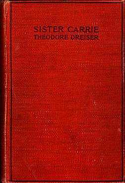
|
Figure 2 Sister Carrie, First Edition – 1900 Source https://en.wikipedia.org/wiki/File:Sister.carrie.cover.jpg |
3)
Chetan Bhagat’s Revolution 2020
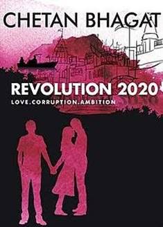
Revolution 2020 is a novel written by Chetan Bhagat who is well known among young readers for his commercial writings. The front cover of the book comes with the title followed by the capitalized subtitle “LOVE. CORRUPTION. AMBITION” in a less prominent font typeface (Figure 3). This subtitle being a paratext acts as a signifier that signifies the ‘themes’ of the work. The novel basically deals with an unfair society where corruption and ambition meet together with ‘love’ as a common thread that connects each other through the triangle love story. A reader could easily sense the thematic signifiers with the help of this paratext. Bhagat (2011)
Figure 3
|
Figure 3 Front Cover – Revolution 2020 Source http://shantihp.blogspot.com/2011/10/revolution-2020-short-review.html |
Today, cover designs play a vital role in making the first impressions of the work. Readers also consider the front cover while purchasing random works of fiction especially in a book fair where the decision making also depends on the cover design. It is a marketing technique to change the cover designs of the published book in order to keep the books on the sale list. The cover design includes the font used in the title, the icons and image, illustrations used in it. There is an image illustration of a boy and a girl standing together to signify that they are lovers, and the same girl holding the hand of another boy (Figure 3). This illustration being a paratext stands for a sign that signify the fact that the story deals with two boys loving the same girl. This interpretation becomes correct when it is connected with the brief storyline given in the back cover of the book which again is another paratext. The readers come to know that the two boys loved the same girl from the blurb of the book.
Figure 4

|
Figure 4 Redesigned Front Cover – Revolution 2020 Source https://www.sapnaonline.com/books/revolution-twenty-20-chetan-bhagat-8129135531-9788129135537 |
As part of a marketing strategy, covers are redesigned in order to invite a new response from the readers in the form of sales. The front cover seems to be redesigned in the revised print edition of Revolution 2020 where the change in the presentation of the title is very obvious at a first glance and becomes unignorable (Figure 4). The letters ‘E, V, O, L’ in the title word ‘Revolution’ is mirrored first and then is highlighted within a small rectangle-shaped box with a difference in font colour both for the letters and the box. When mirrored, it stands to signify ‘Love’, being one of the themes of the book. The mirrored image serves to be a sneak peek for readers as it comments on the strangeness of the theme ‘love’, which is also explicitly revealed as ‘two boys loved the same girl’ from the blurb in the back cover of the book. It is to be noted that the first and the last letters ‘L’ and ‘E’ respectively in the sign ‘Love’ has the capacity to be mirrored as the letters ‘O’ and ‘V’ do not cause any change even if mirrored. This is how cover design functions to be paratextual signifier for unfolding meanings relevant to the theme of the novel.
4)
Charlie Chaplin’s The Great Dictator
Parody is generally understood as a work or performance that imitates another work or performance with ridicule or irony. Generally, a parody focuses on the imitation of the subject matter of a text with an ironical output. British comedian Charlie Chaplin in the film ‘The Great Dictator’ impersonates like Hitler for producing comic effect. The very appearance of Hitler in Chaplin creates a comic effect thereby making the film a political satire comedy-drama. Chaplin (1940)
In the field of literature, a parody comes with the effective imitation of the content of the parodied work in a satirical and ironical way. Apart from the content, Paratexts also takes up a stand in detailing the imitation of a work which fulfils the nature of parody from cover to cover. The audience witness the implied visual meaning and associate it with the genre of the film with Charlie Chaplin’s facial pose and the title signifiers in the film poster. The effect of the title ‘The Great Dictator’ is to be understood in a satirical context with the very name inscribed ‘Charlie Chaplin’ in the film poster (Figure 5). The variety in Charlie Chaplin’s pose and his actions depicted in the film posters leave a humoristic and sarcastic expectation about Chaplin’s role in disguising as the real dictator Hitler in the minds of the audience before watching the film.
Figure 5

|
Figure 5 Film Posters Depicting Charlie Chaplin as Hitler, Row House Cinema, 1941 Source http://quotesgram.com/famous-dictator-quotes/ https://moviemem.com/products/movie-posters-found-in-victorian-shed/the-great-dictator-original-3-sheet-movie-poster and http://geekynerfherder.blogspot.co.nz/ |
5) Chetan Bhagat’s Two States and Judy Balan’s Two Fates
Chetan Bhagat’s 2 States subtitled as ‘The Story of My Marriage’ turns out to be a popular novel and has been adapted into a film with the same title. The novel is a love story between Krish, a Punjabi boy and Ananya, a Tamilian girl, who convince their parents to approve their marriage. Bhagat’s novel was published in 2009 Bhagat (2009). Judy Balan, a comedy writer, and author has written a novel titled Two Fates with the subtitle ‘The Story of My Divorce’ as a parody to Chetan Bhagat’s Two States. Judy Balan’s fiction is a tale of Deepika and Rishab who belong to two different states fall in love and convince their parents for their wedding. However, the author has devised a parody here by adding a twist in the plot that after a few years of their togetherness, they want to divorce and work as a team to draft a plan on breaking the news to their parents.
The front cover of Chetan Bhagat’s 2 States features the map of Tamil Nadu and Delhi where the facial icons of the two lovers Ananya and Krish takes place respectively. The cultural difference is signified through two ropes, red and white respectively, tied together and placed just below the subtitle signifying the wed-lock in Bhagat’s front cover.
On the other hand, in Judy Balan’s Two Fates, the front cover comes with caricatures representing people who are dressed up in the attire that denotes their respective states. This stands as a paratextual signifier for the parents of the lovers from the two different states and two ropes in different colours tangling between the partners who are planning to divorce. The tangled rope in Balan’s front cover parodies with the typical wed-knot in Bhagat’s cover (Figure 6). This shows that the front covers are designed after taking into consideration the themes that cause the parodying effect. Balan (2011)
Figure 6

|
Figure 6 Front Covers of Two
States and Two Fates Source https://www.pinterest.com/pin/177047829080554770/ and https://m.media-amazon.com/images/W/WEBP_402378-T2/images/I/51HkNgs-iHL._SX322_BO1,204,203,200_.jpg |
6) Chetan Bhagat’s Half Girlfriend and Judy Balan and Kishore Manohar’s Half Boyfriend
Soon after the reach of the first parody, Judy Balan and Kishore Manohar came up with their second work of imitation with the title Half Boyfriend, a parody of Chetan Bhagat’s Half Girlfriend. The front covers of both the novels include the background of tall buildings that reveal a cosmopolitan setting of the plot. In Half girlfriend, Madhav Jha who is from rural Bihar tries to develop his friendship and falls in love with Riya Somani, a high-class English-speaking girl, who in turn agrees to be his half girlfriend. The title in the cover page separates the icons of Madhav and Riya denoting the distance in their relationship, where Madhav wishes to hold on the same. In Half Boyfriend, a feudal rich boy named Manav meets a city girl Rhea. Manav is a stalker who could not speak English but know how to make use of the same as his advantage to talk with Rhea. The front cover of Half Boyfriend clearly distinguishes the icon of the boy from that of Half Girlfriend. The boy with a rose in the front cover and the girl who tries to run away from him, reveal the nature of the boyfriend in this novel (Figure 7). There is an imitation even at the level of cover design thereby making paratext a sign once again that works well with parody too. Thus, paratext stands an indispensable sign that adds the level of imitation to make a text a parody from cover to cover. Balan & Manohar (2016), Bhagat (2014)
Figure 7

|
Figure 7 Front Covers of Half Girlfriend and Half Boyfriend Source https://m.media-amazon.com/images/w/webp_402378-t2/images/i/51gwjkb4eql._sx326_bo1,204,203,200_.jpg and https://m.media-amazon.com/images/I/412lpnz4yYL._SX318_BO1,204,203,200_.jpg |
7)
Terry Deary’s ‘The Vile Victorians’
The book with a same title but a different cover design is
a part of a promotional factor in the marketing field. As discussed earlier,
cover design is a part of paratext that contributes meaning to the text. For an
illustration-based book, the cover design too comes with an interesting
illustration that unveils an idea about that book. Terry Deary’s ‘The Vile
Victorians’, created as a part of Horrible Histories series, is discussed here
to symbolize how cover illustrations are crafted curious enough to signify the
title. Deary
(1994)
The following are the examples of an illustration-based History book titled ‘Vile Victorians’ with an illustration of ‘Queen Victoria’ on the front cover. The illustration of a photographer asks the queen to ‘Smile Please’ for which the Queen in the illustration replies ‘I am smiling’ without even smiling (Figure 8). These two speech bubbles along with the illustration of the Queen posing for the photographer are paratexts by itself and a signifier for the title ‘Vile Victorians’. The visual signifiers in the second cover include the highlighted words ‘Very amusing!’ that contrasts its meaning with Queen’s facial expression thereby acting as a sign that reveals the meaning behind the title ‘Vile’.
Figure 8

|
Figure 8 Front Covers of the
Vile Victorians Source https://m.media-amazon.com/images/I/51MkcrdNqNL.jpg and https://i.gr-assets.com/images/S/compressed.photo.goodreads.com/books/1471512683l/31551519.jpg |
5. conclusion
The examples given above clearly establish the relation between the cover design and the work of art at metaphoric, semiotic and paratextual level. Each and every part of paratext is a sign with its own signifier and signified. At one hand, paratexts collectively contribute meaning to the text and at the same time, each and every element of it stands independently to contribute meaning to the text. The literariness of the paratext is that the reader can himself or herself decide whether to buy a book or not much with the meanings signified in the paratext itself. Paratexts, apart from contributing itself to the meaning of the title or theme of the work, acts as an advertising strategy for a book to stand its test of the time. The relevancy of the textual content is hidden and revealed through paratexts and it is left to the readers’ eyes to make a meaning out of it even before reading the entire book. Cover designs, illustrations and the subtitles are considered to be the indispensable paratexts that act as an influencing factor for readers to decide on the purpose of reading or buying the book. Thus, this research paper emphasizes the semiotic significance of paratexts in literary texts, and parodies in particular, and highlights the nuances employed at the level of imitation crafted creatively from cover to cover. Further, this research paper also brings out the semiotic relation between paratexts and parody in the world of publishing and marketing.
CONFLICT OF INTERESTS
None.
ACKNOWLEDGMENTS
None.
REFERENCES
Balan, J. (2011). Two Fates : The Story of My Divorce. Westland.
Balan, J., & Manohar, K. (2016). Half Boyfriend. Bloomsbury.
Bhagat, C. (2009). 2 States : The Story of My Marriage. Rupa Publications Pvt. Ltd.
Bhagat, C. (2011). Revolution 2020 : Love, Corruption, Ambition. Rupa Publications.
Bhagat, C. (2014). Half Girlfriend. Rupa Publications India Pvt. Ltd.
Buchanan, I. (2010). A Dictionary of Critical Theory. Oxford.
Chaplin, C. (Director). (1940). The Great Dictator [Film]. Charles Chaplin Film Corporation.
Deary, T. D. (1994). Horrible Histories : Vile Victorians. Scholastic UK.
Dreiser, T. (1997). Sister Carrie : Unexpurgated Edition. Doubleday.
Genette, G., & Lewin, J. E. (1997). Paratexts : Thresholds of Interpretation. Cambridge University Press.
Genette, G., & Maclean, M. (1991). Introduction to the Paratext. New Literary History, 22(2). https://doi.org/10.2307/469037.
Miller, D. L. (1996). City of the Century : The Epic of Chicago and the Making of America. Simon & Schuster.
Pal, A. (2003). Paratext and Interpretation of Fiction [Doctoral Dissertation, Central Institute of English and Foreign Languages, Hyderabad].
|
|
 This work is licensed under a: Creative Commons Attribution 4.0 International License
© ShodhKosh 2023. All Rights Reserved.